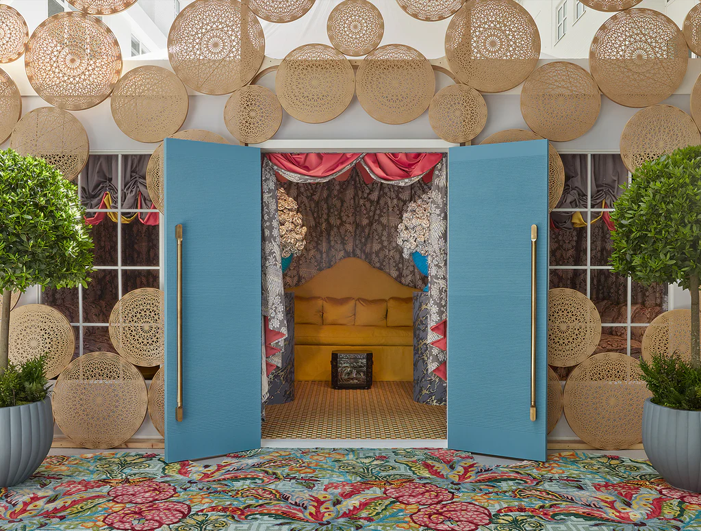
A few weeks ago I visited Wow!house at the Chelsea Design Centre. This is the third Wow!house exhibition – a set of 19 spaces, each created by a different designer. Each space is a full-sized room complete with ceilings and the designers have free rein to create a space to showcase their work. It’s a huge space, stretching 500 square metres, and is a must-visit event for every interior designer.
Designed to be an immersive journey to experience at first-hand the work of the best interior designers in the world, a walk through the nineteen spaces takes you through all the most important design trends of the year. Here I will guide you through most of the main rooms, to give you a flavour of the event.
The tour starts with an entrance hall designed by super-cool designer of the moment, Benedict Foley for Zoffany. Inspired by Visconti’s film The Leopard, Benedict draped the walls in fabric to create the effect of damask dresses. Fabric used on walls was a recurrent theme of the Wow!house designers this year.
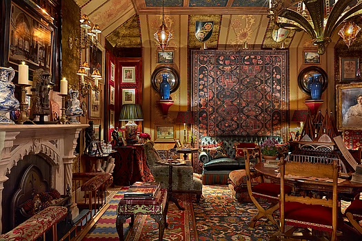
This foyer was followed by the first room – designer Alidad’s Watts 1874 Legend Room, a maximalist’s dream designed to showcase Alidad’s knowledge and eye for antiques and textiles. Layering up different patterns and using a palette of warm, earthy colours is the take away from this totally over the top extravagent room.
In contrast, the Study by Fosbury Architects was very zen and featured yellow fabric covered Macs, which I was rather taken by!
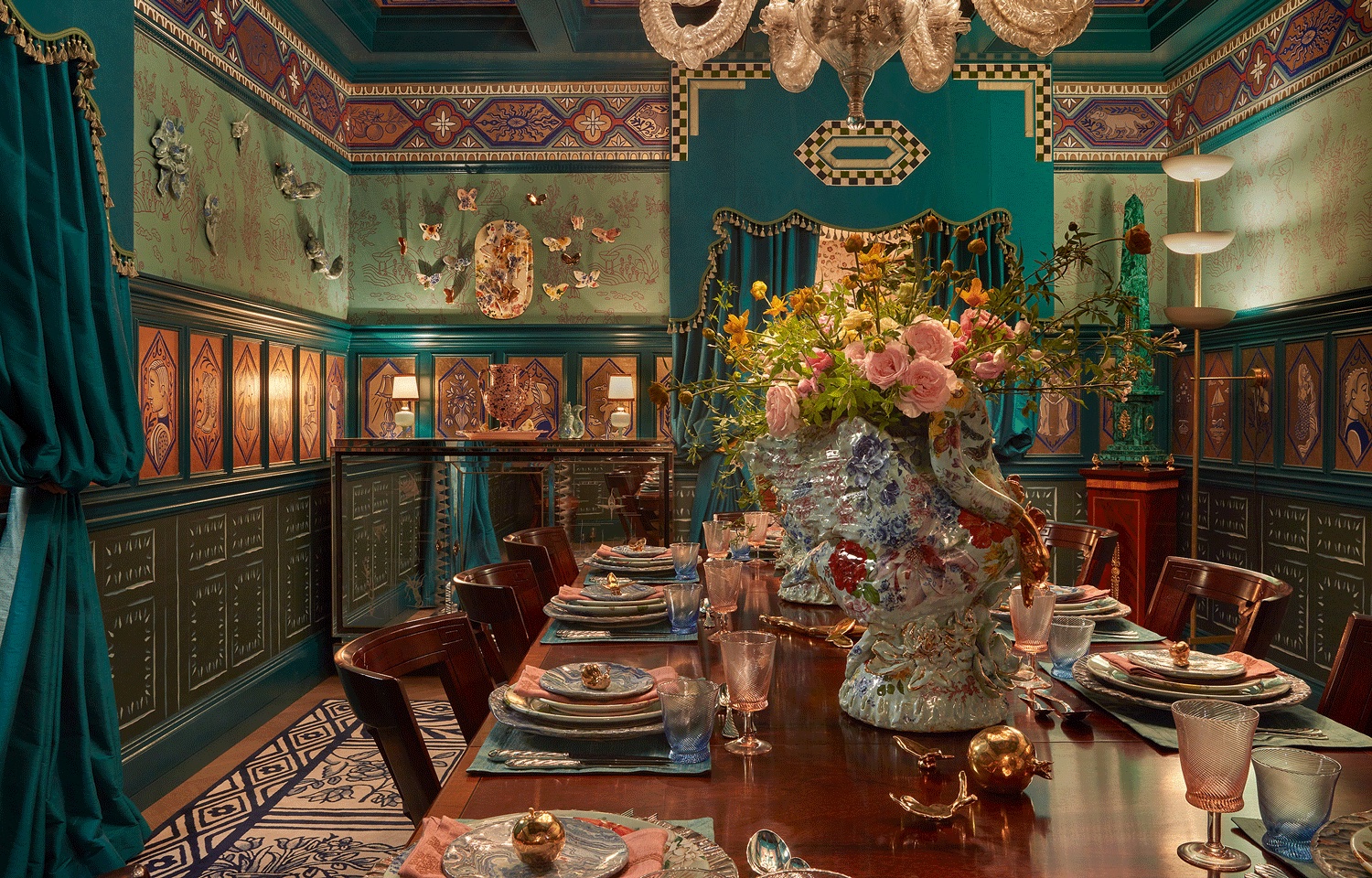
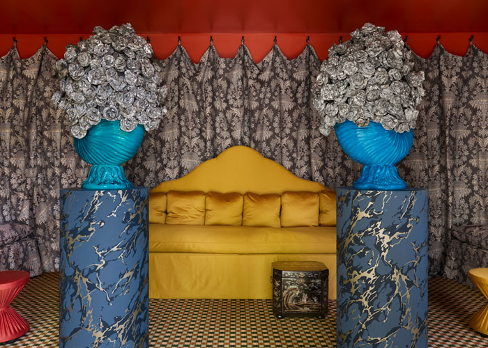
Ken Fulk’s dining Room was sponsored by The Rug Company. The room was designed for a Countess and her artist friends and was very glamorous!
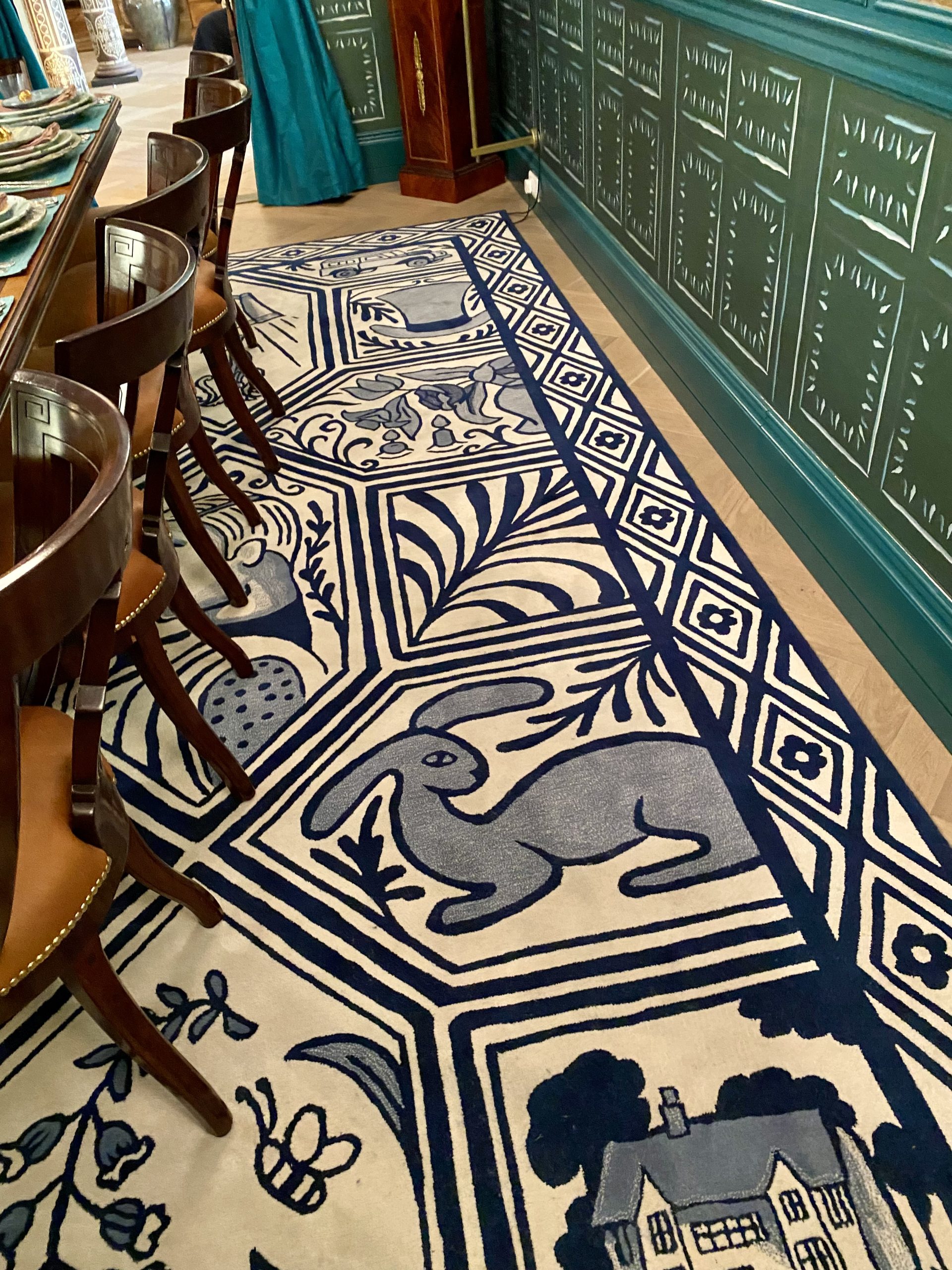
The fabulous rug was inspired by Delft tiles. This room had a painted ceiling, as did many of the rooms. Definitely a big trend for 2024.
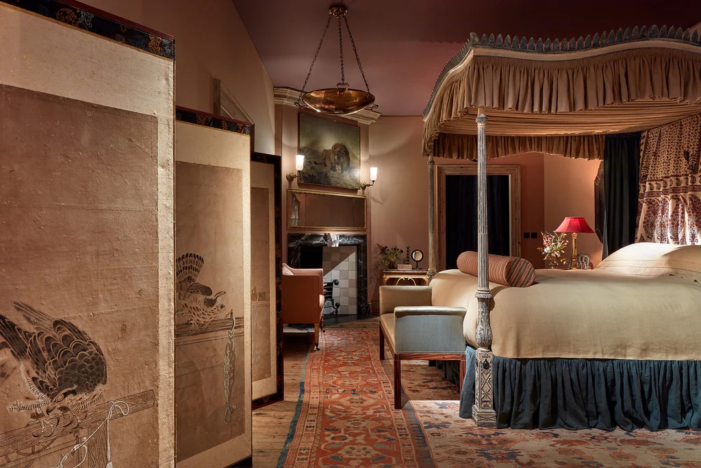
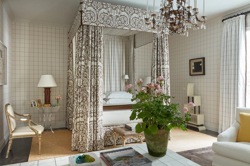
The bedroom by Charlotte Freemantle and Will Fisher took inspiration from the colours and fabrics seen in Renaissance paintings. I loved the romantic feel the colours gave to this room – deep greens, delicate sages, raspberry and the soft dusky pink on the walls.
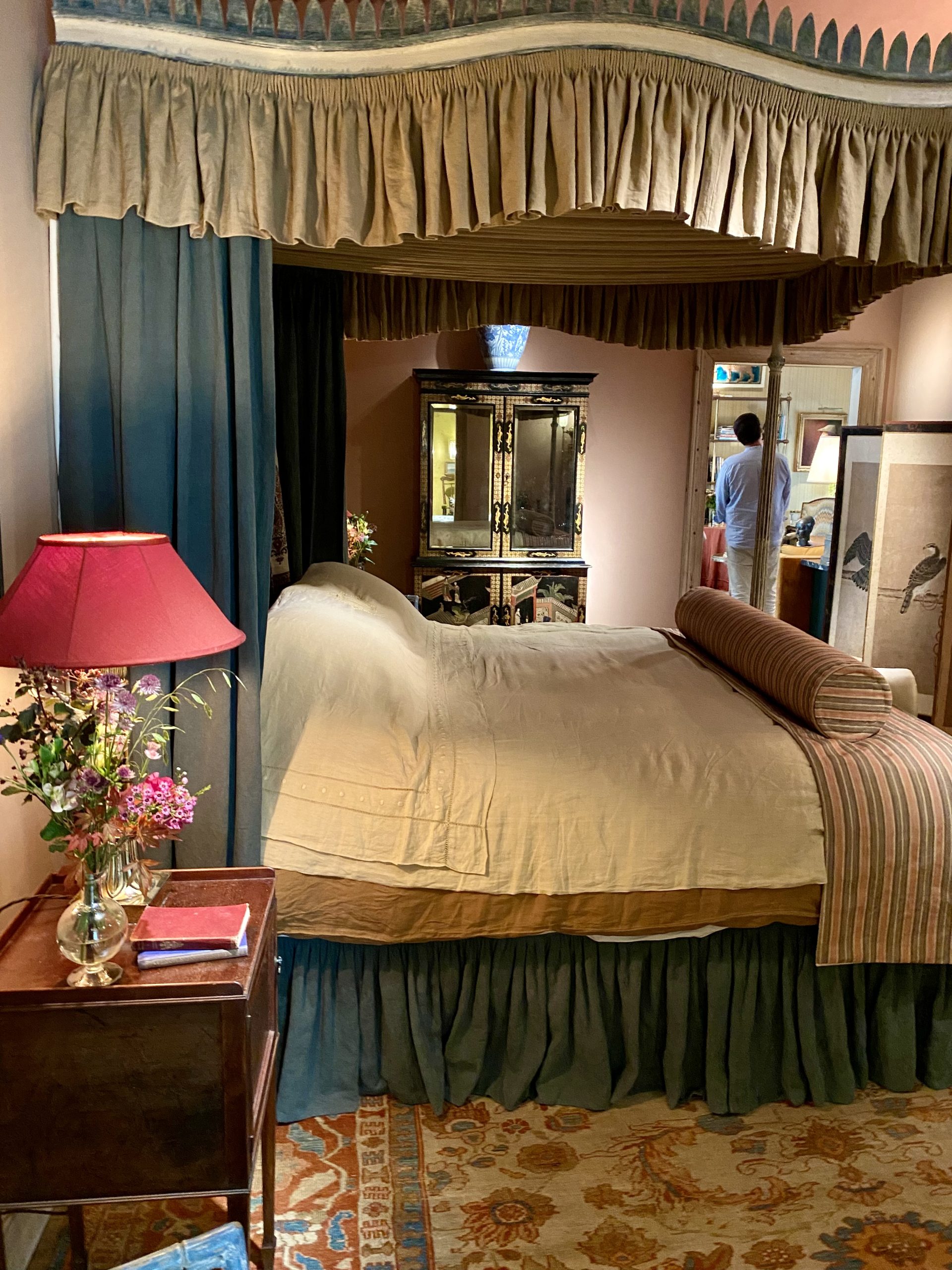
If you have room, a four poster bed is a rather wonderful extravagant addition to a bedroom.
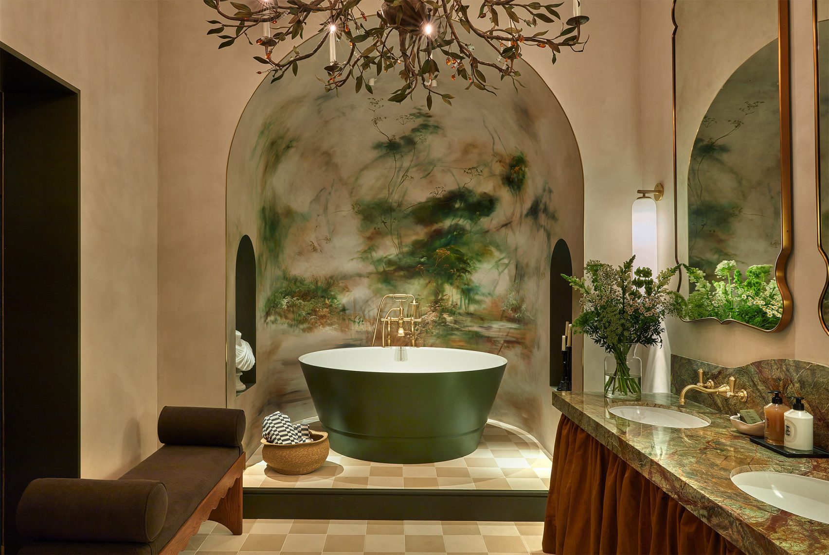
Probably my favourite spaces were the stunning bath, shower and wash zones in the bathroom by Michaelis Boyd for House of Rohl.
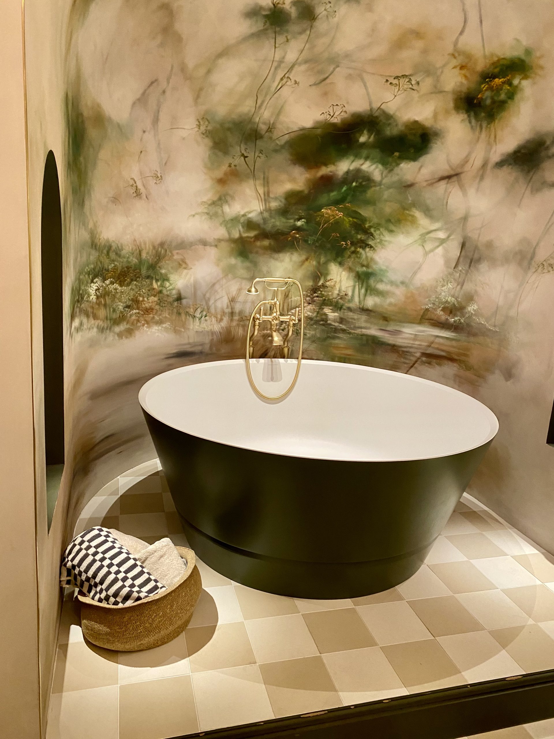
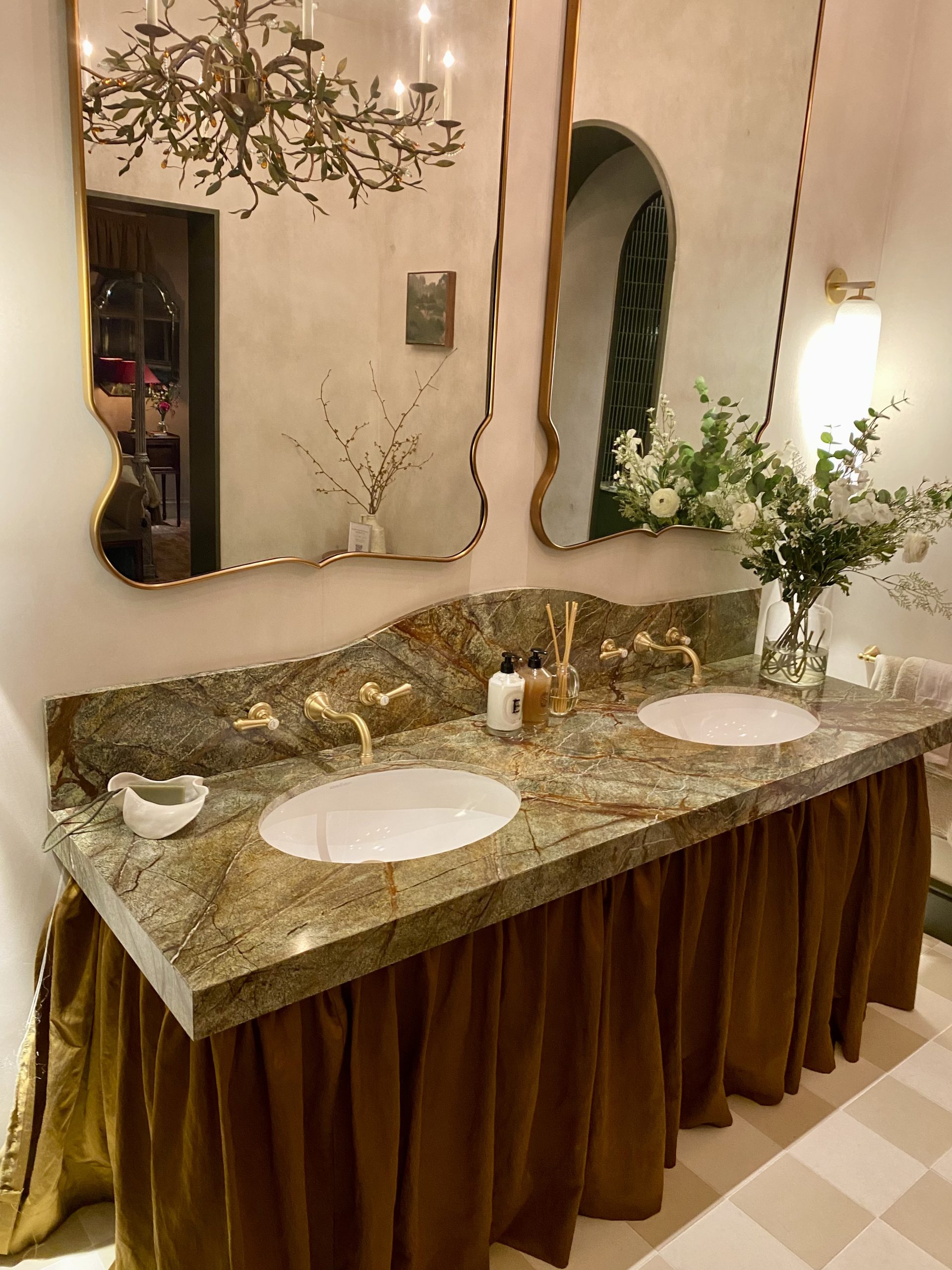
The deep round bath was the centrepiece, but the green tiles, the green marble sink tops, the beautiful mirrors and lighting and the chequered floor were all beautifully curated in this stunning space.
Designer Lucy Hammond Giles celebrated the 90th anniversary of Sibyl Colfax & John Fowler with her morning room design, inspired by Virginia Woolf’s “A Room of One’s Own”. The chintz fabrics were traditional Colefax & Fowler, but it was the wall colour that really stood out. The yellow is from the Yellow Room at 39 Brooke Street, where the company was based in the 1950s. It’s a strong earthy tone which would work well with spicy colours or muted blues and pinks.
Another interesting bedroom was the Veere Grenney room by Schumacher. The star of this room for me was the Schumacher “Suffolk Damask” used on the four-poster bed. It shows brown fabric can be incredible in the right setting! Tiles on the bedroom walls was another interesting takeaway from this room.
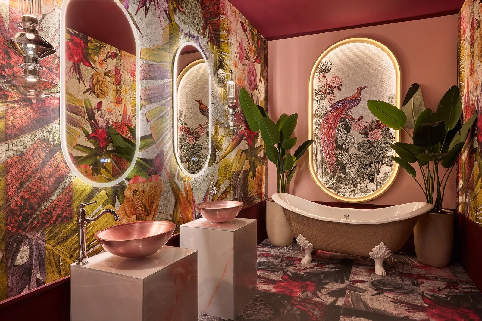
Awakening spring was the theme of Maurizio Leo Placuzzi’s bathroom.
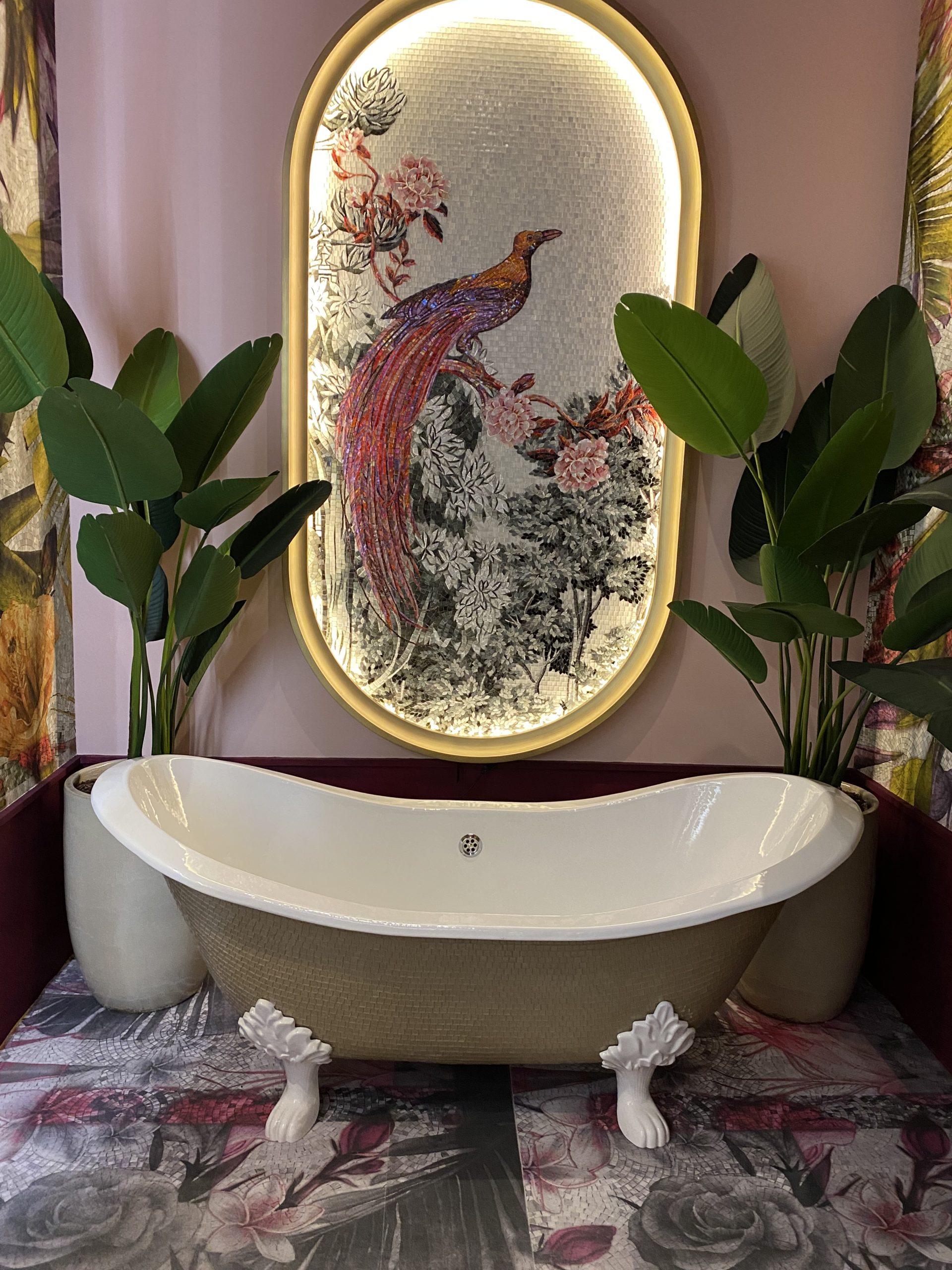
It was a real Instagrammable combination of dramatic botanicals and metallics.
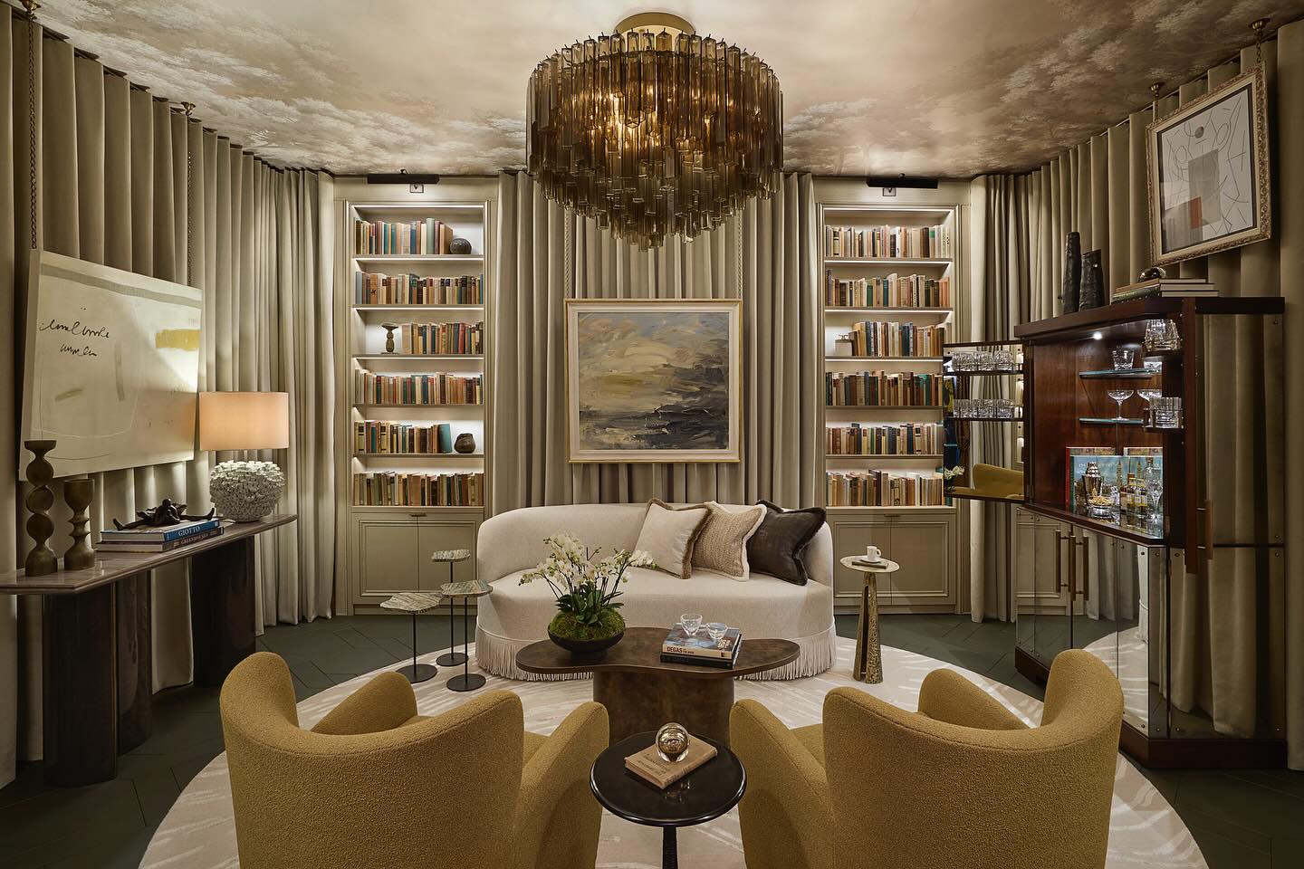
The library was designed around the concept of ballet and theatre as designer Andrea Benedittini was a ballet dancer before turning to interior design.
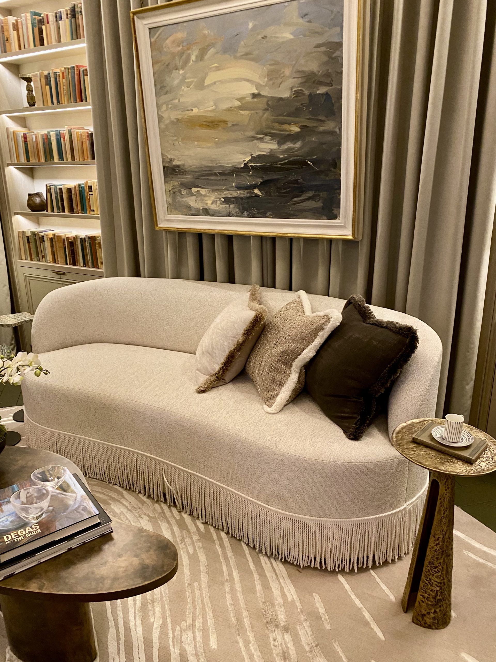
I loved the rounded shapes of the sofas and the fabulous mustard-coloured chairs.
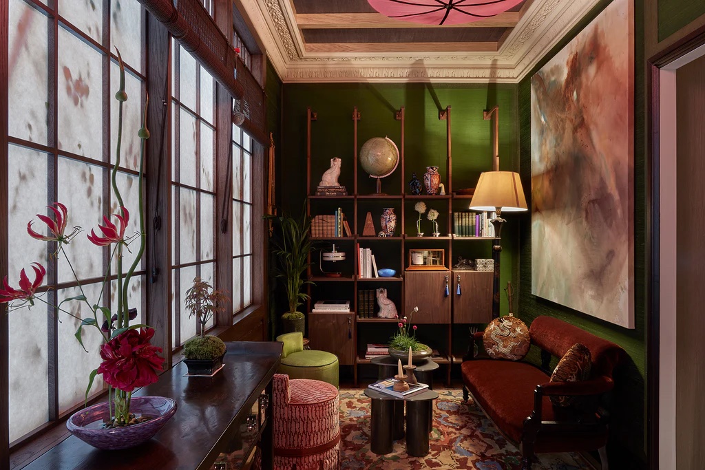
The study by Anahita Rigby, featured green silk covered walls. Deep green is definitely here to stay and is a colour that will stand the test of time.
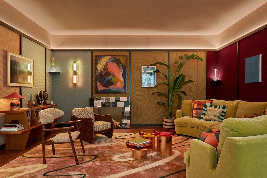
The sitting room by Sophie Ashby was another of my favourite rooms. It was a warm relaxing room full of colour and creative ideas. It was a calming space that felt modern despite the mid-century inspired furniture.
The dining room created by Suzy Hoodless was inspired by the trees and flowers of Cornwall, where she now lives.

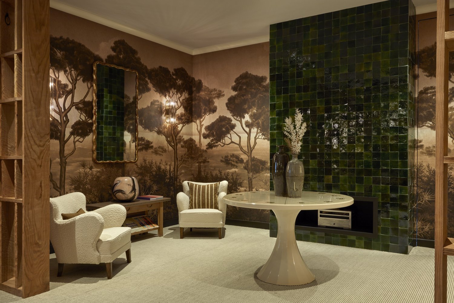
Murals designs were a recurrent theme at Wow!house and I have use them very successfully in some of my recent projects.
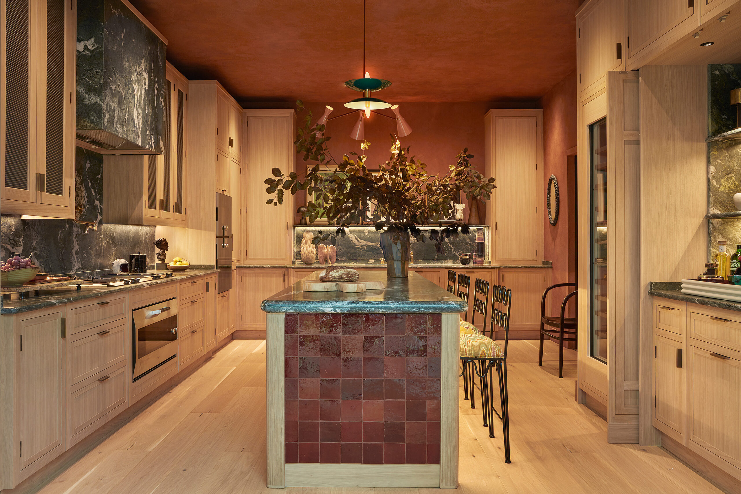
A beautiful Martin Moore kitchen crafted from natural timber in a pale finish was the only kitchen at Wow!house. The island made from handmade tiles was a dramatic centrepiece. Described as a kitchen “for people who love gastronomy and art, and those who like to entertain”, I think it fitted the brief.
A visit to Wow!house is interesting and thought provoking and I can’t wait for next year’s event already.
Images: Chelsea Design Centre/Clair Strong Interior Design


