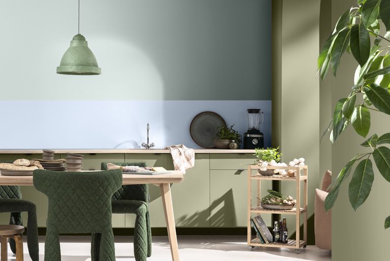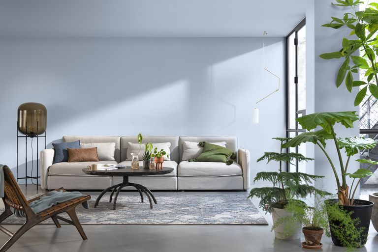
Dulux has announced its Colour of the Year for 2022 as Bright Skies™, an airy light blue that perfectly captures the optimism and desire for a fresh start that is the mood of the moment.
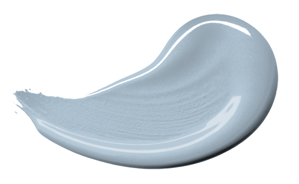
Chosen at a virtual summit by leaders in design, fashion and colour, Bright Skies™ is a colour that good for the soul and will inject life and hope into any living space. Dulux’s Colour of the Year aims to capture the mood of the moment and the essence of what we want and need in our homes for the year ahead. The choice of a clear warm blue helps to reconnect us with a cloudless summer sky and all the freedom and possibilities nature has to offer.
Marianne Shillingford, the Creative Director of Dulux in the UK, said: “Right now, people want to feel revitalised and enjoy the freedoms that are returning to them, to look out and bring in new ideas. What better inspiration can we take than the endless skies around us? It is widely known that nature makes us feel better and taking steps to bring the outside in enhances our sense of wellbeing.”
Reflecting the limitless skies around us, Bright Skies is a colour that works with a host of other shades – from soft neutrals to joyful brights. It’s a really adaptable colour which is perfect for small spaces, brightening up a living room alcove, or used on the ceiling. Dulux hope that decorating our homes with this colour will make us feel joyful, uplifted, optimistic and free.
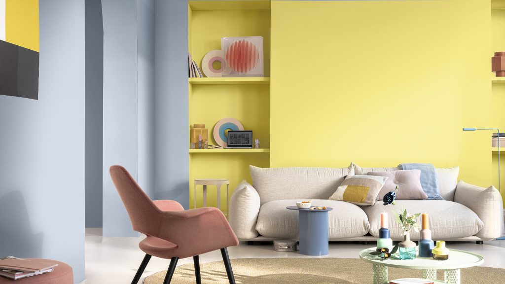
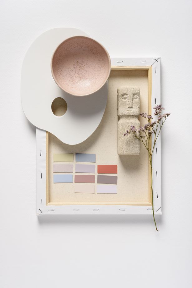
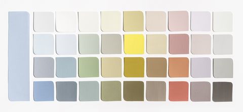
If you are wondering what colours you can pair with Bright Skies, Dulux have taken the guess work out if it. They have created four colour palettes from soft neutrals to joyful brights – Greenhouse, Salon, Studio and Workshop – to complement Bright Skies. These colour palettes are designed to be used on the walls, as well as in accessories and furniture.
Bring the outside in with the fresh naturals of the Greenhouse palette, filled with verdant greens and blues. Bring nature into a room with plants and natural materials like cork.
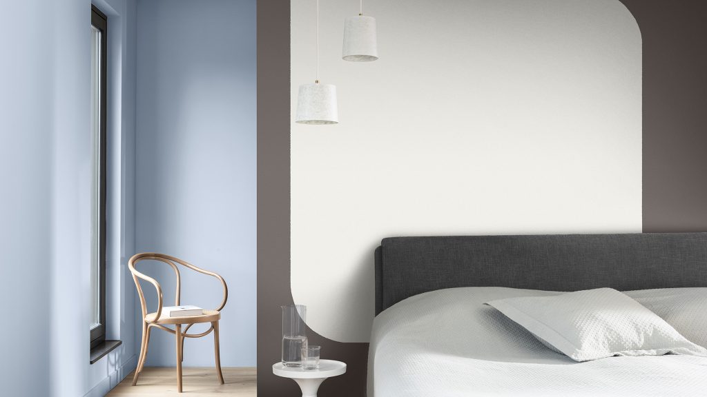
If you want your home to be a soothing space where you can recharge and feel inspired, the Studio colour palette is the one for you. Together, this soft mix of pale pinks, reds and oranges will help you escape the everyday and create a sanctuary, away from the hustle and bustle of modern life.
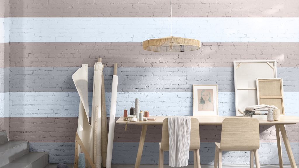
The vibrant and joyful colours in the Workshop palette are full of combinations of light, uplifting tones aimed to create an inspirational backdrop for any activity.
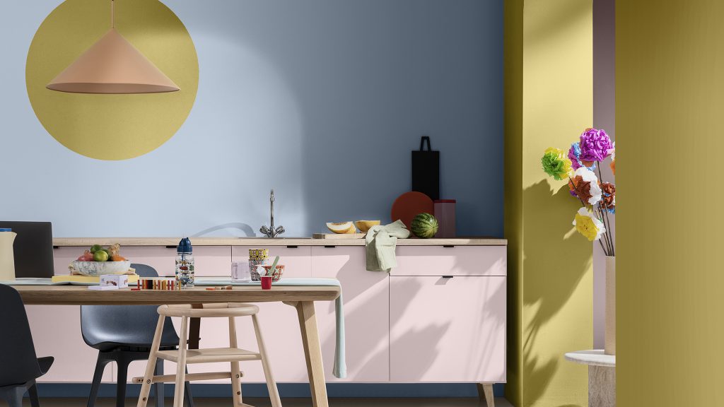
Blue Skies is designed to be an airy, light blue that’s fresh, open and good for the soul. What do you think?
All images: Dulux
