Farrow & Ball added 12 new colours to their signature palette at the end of February. These are the first new colours since 2022 so it’s big news for interior designers. Nine of the colours are completely new shades and three are familiar favourites.
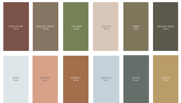
The new colours mean 12 colours are archived. They remain available to buy but don’t appear on their 132 shades colour card.
From simple household objects like jam jars and garden tools, these earthy grounded shades are inspired by the everyday.
Over the last few years, we’ve relished living with colour. It’s opened our eyes to all the shades surrounding us, which we often don’t think about. The treasures right under our noses. Now, we’re ready to embrace more colour and celebrate these unsung heroes in our homes.
Joe Studholme, Colour Curator.
Now let’s get straight to the colours…
Scallop
This lighter interpretation of Dead Salmon is inspired by both the soft hue and gentle, curved shape of the prized shellfish.
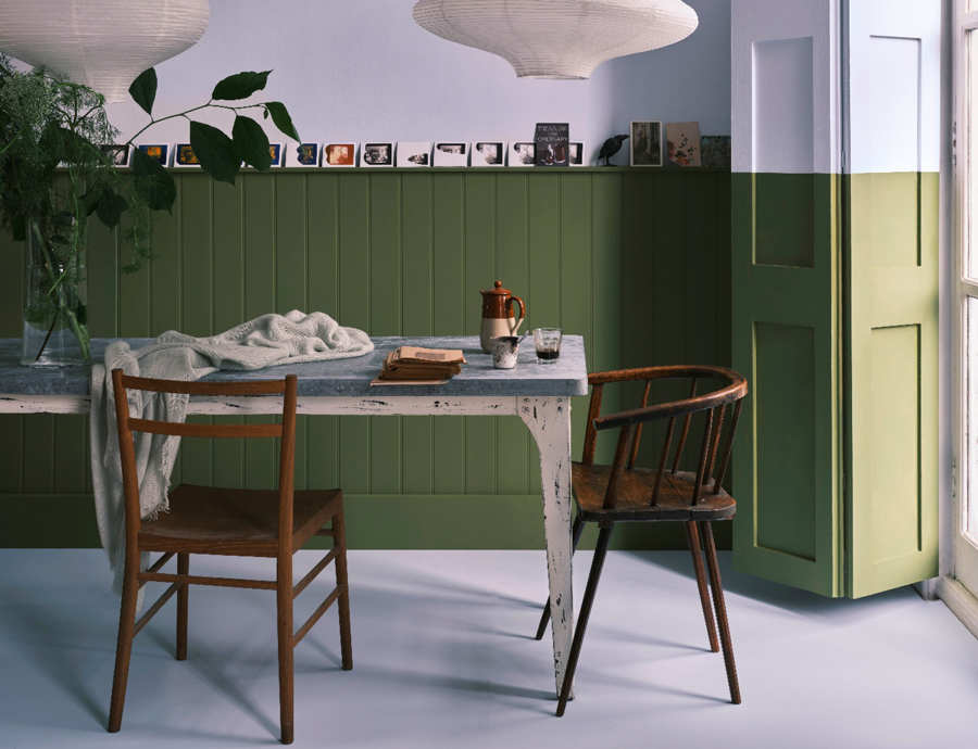
Dibber
Named after the tool beloved by gardeners to create holes for planting seeds or bulbs, this muddied green has a close association with the natural world.
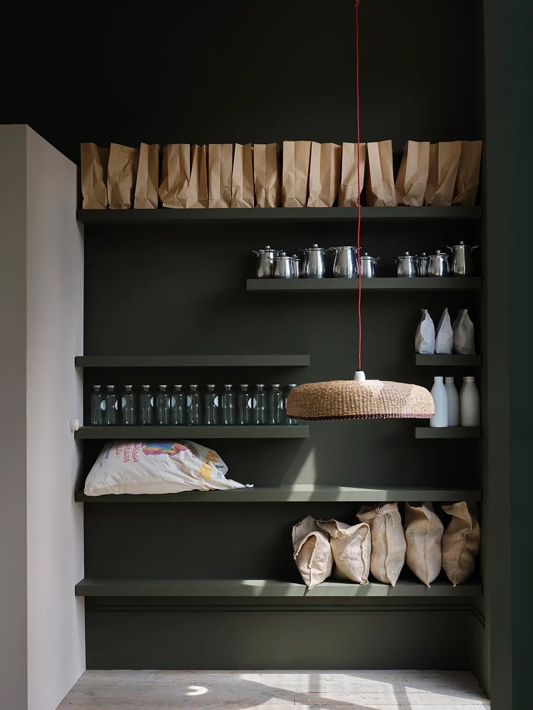
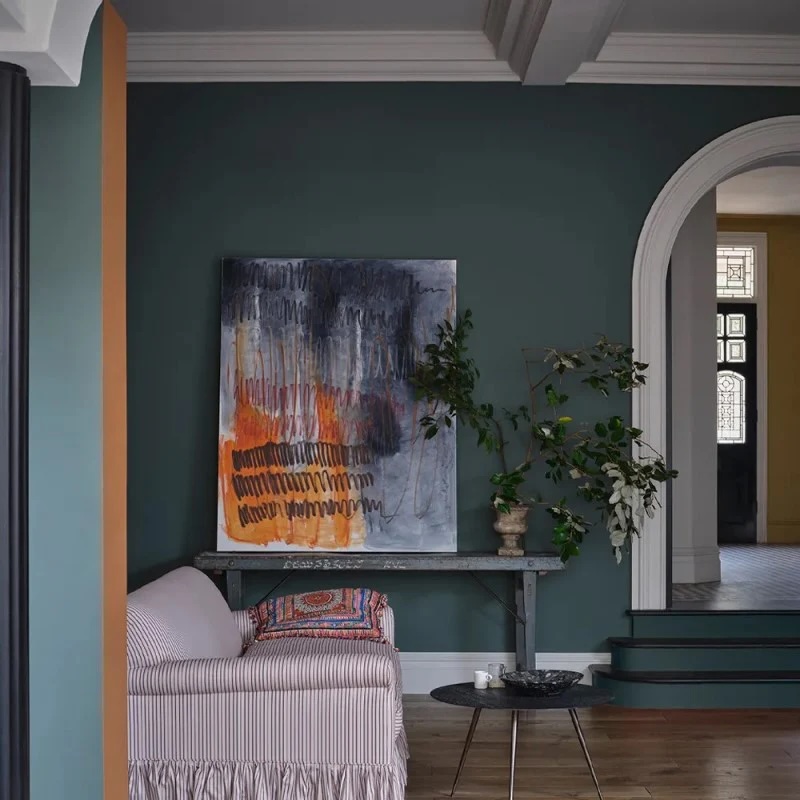
Reduced Green
The green pigment in this dark neutral has been reduced so much that it’s barely there – some see brown, while others see green.
Sizing
A fresh neutral with distinctive blue undertones, this colour has a certain crispness like the starch it is named after.
Naperon
Inspired by the origins of the word apron, this is a familiar clay colour with a well-loved feel.
Marmelo
Named after the marmelo quince, the inspiration for marmalade, this is a thoroughly comforting shade.

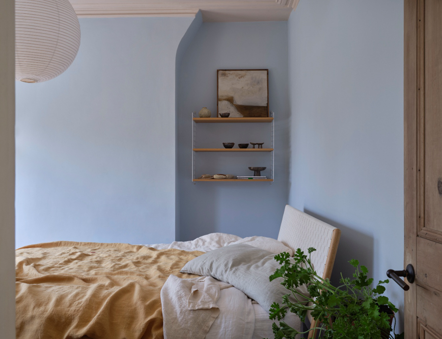
Kakelugn
This highly requested, cleaner interpretation of Light Blue takes its name from the folkloric fires of Sweden, often decorated in this shade.
Douter
Inspired by the soot and tarnished brass of traditional candle snuffers, this is a green interpretation of our beloved Inchyra Blue.
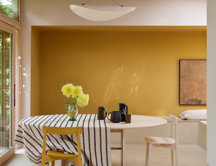
Duster
An aged yellow celebrating the ever so familiar cloth used to clean homes worldwide.
And returning from the Archives are these colours
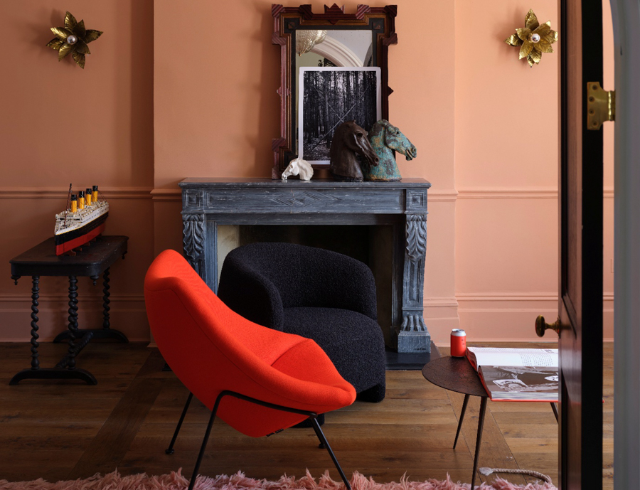
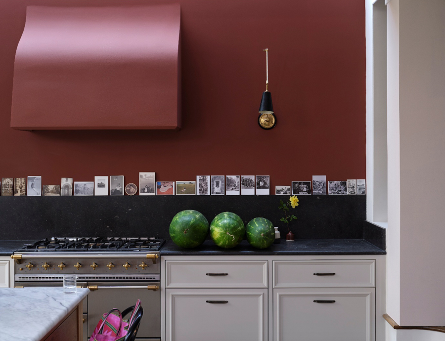
Etruscan Red
An earthy red inspired by an ancient civilisation. Less intense than Preference Red, it’s still undoubtedly rich without being overwhelming.
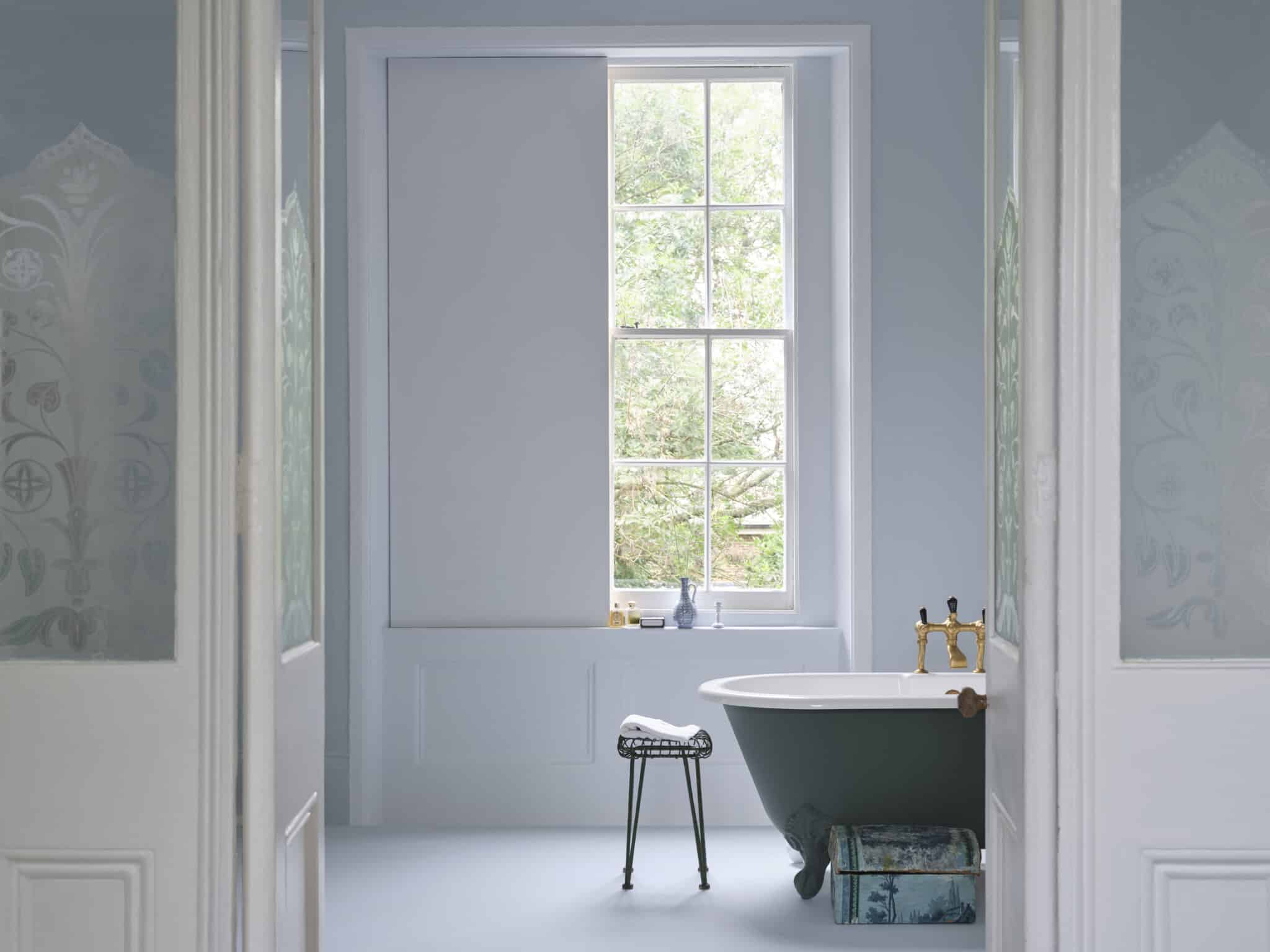
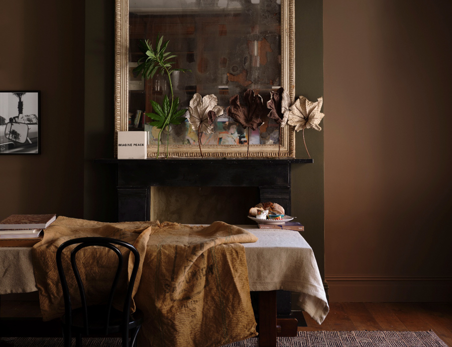
Broccoli Brown
A dark, quiet colour that sits effortlessly alongside natural materials, such as weathered wood or flagstone floors. It feels reserved and comforting in equal measure.
Sap Green
An enticing olive shade, Sap Green is a true celebration of nature and feels wonderfully intense in small spaces.
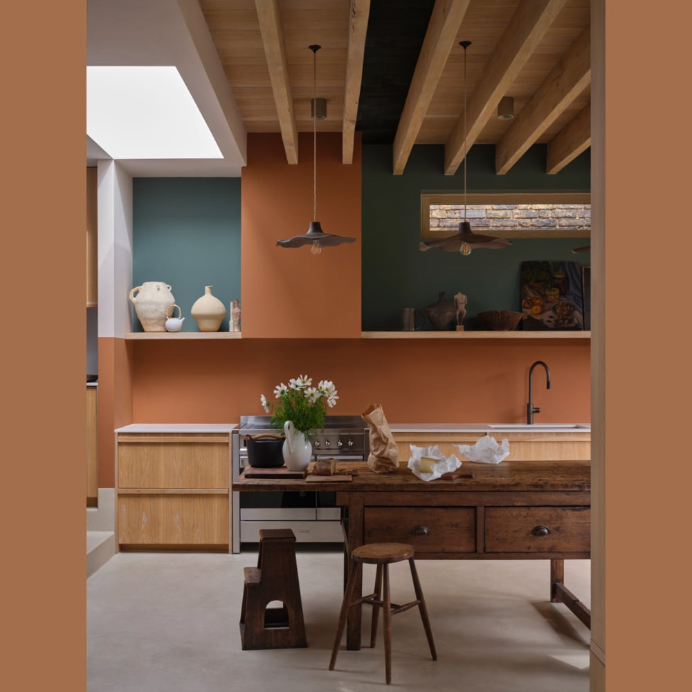
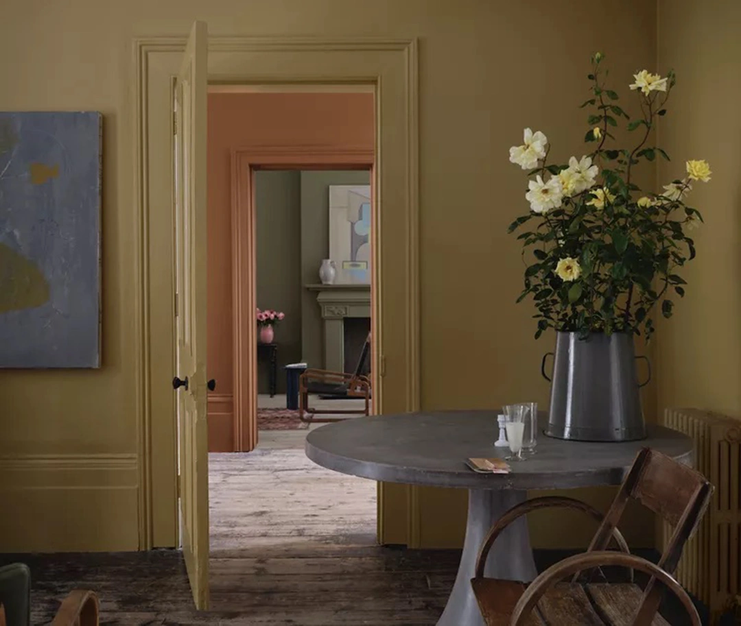
I can’t wait to use some of these beautiful colours in my upcoming projects. I think the greens – Dibber, Douter and Reduced Green – will work beautifully with Georgian houses and Scallop will look wonderful on ceilings. Kakelugn will be hugely popular as a wall colour. It’s a wonderful collection. Bravo Farrow & Ball it was worth the wait.
All images Farrow & Ball


