Red and green are opposite each other on the colour wheel. They are complementary colours which means that the one colour they don’t have in their shade is the one that sits opposite them. Red is a primary color and green is a mix of yellow and blue (the other two primary colours). Complementary colours create visual tension and a dynamic interesting scheme when used in interior design.

Red and green are strong contrasting colours when used together. Red is a strong, attention grabbing colour which stops us in our tracks. Green is a peaceful calming colour that reminds us of the natural world; used together they are the perfect balance of warm and cool.
Red and green are often seen as the colours of Christmas so people are afraid to use them together, but used in the right way they can look incredibly stylish.
The key is to use the right tones of red and green. Dark or muted tones avoid the Christmassy connotations and can create a cosy, sophisticated look to a room.
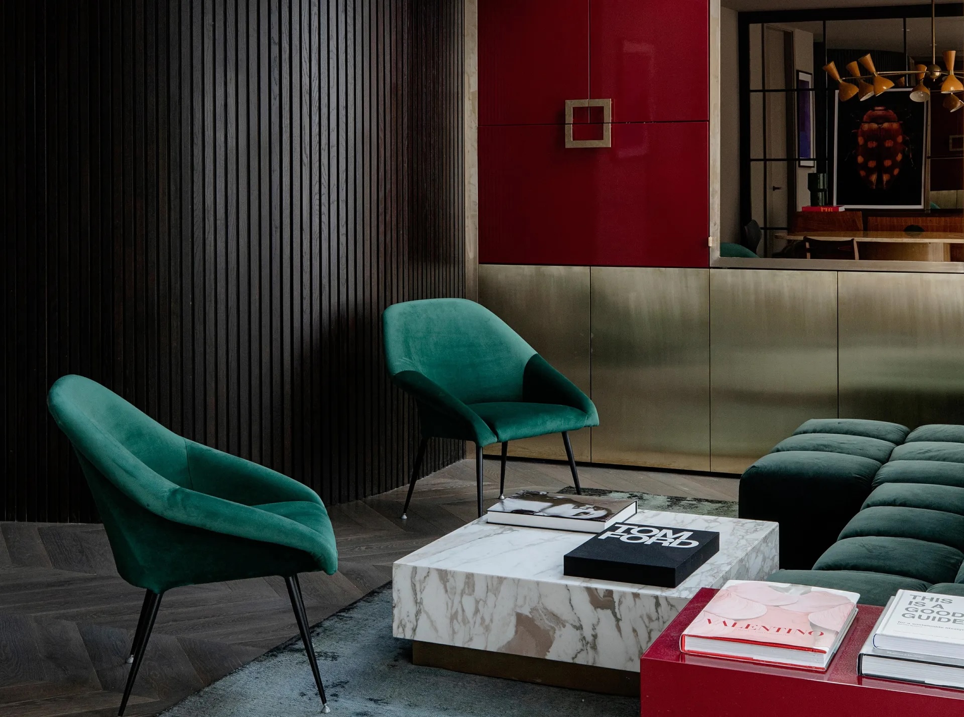
Avoid primary colours and choose rich tones like burgundy and emerald green to create an intimate and luxurious look in a sitting room or dining area.
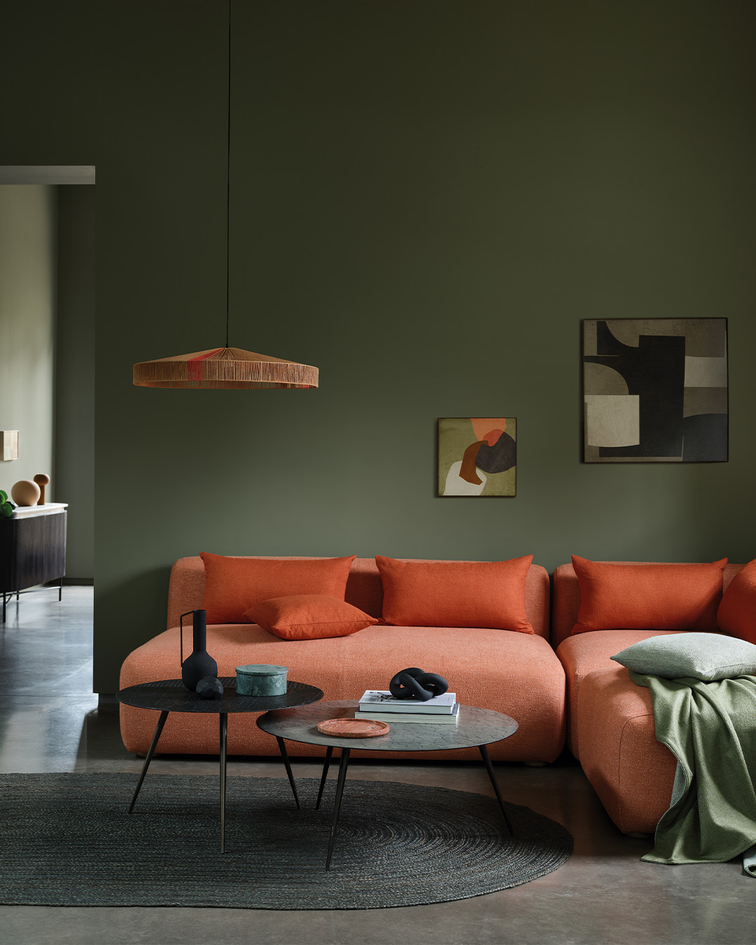
There are myriad tones of red and green. From sage and mint to olive and deep teals and terracotta, blood reds, and deep pinks there are lots of wonderful colours you can use to create a striking look.
You can mix red and greens with other colours. They work well with metallics, but also blacks and neutrals which help soften the look. They don’t need to dominate the scheme.
Check out some of the examples below.
Here Benjamin Moore’s Harrisburg Green, which is a a lively jade spiked with blue undertones, is combined with a deep wine hue. Benjamin Moore subscribes to the unexpected red theory – believing a flash of red adds drama and sophistication to any room.
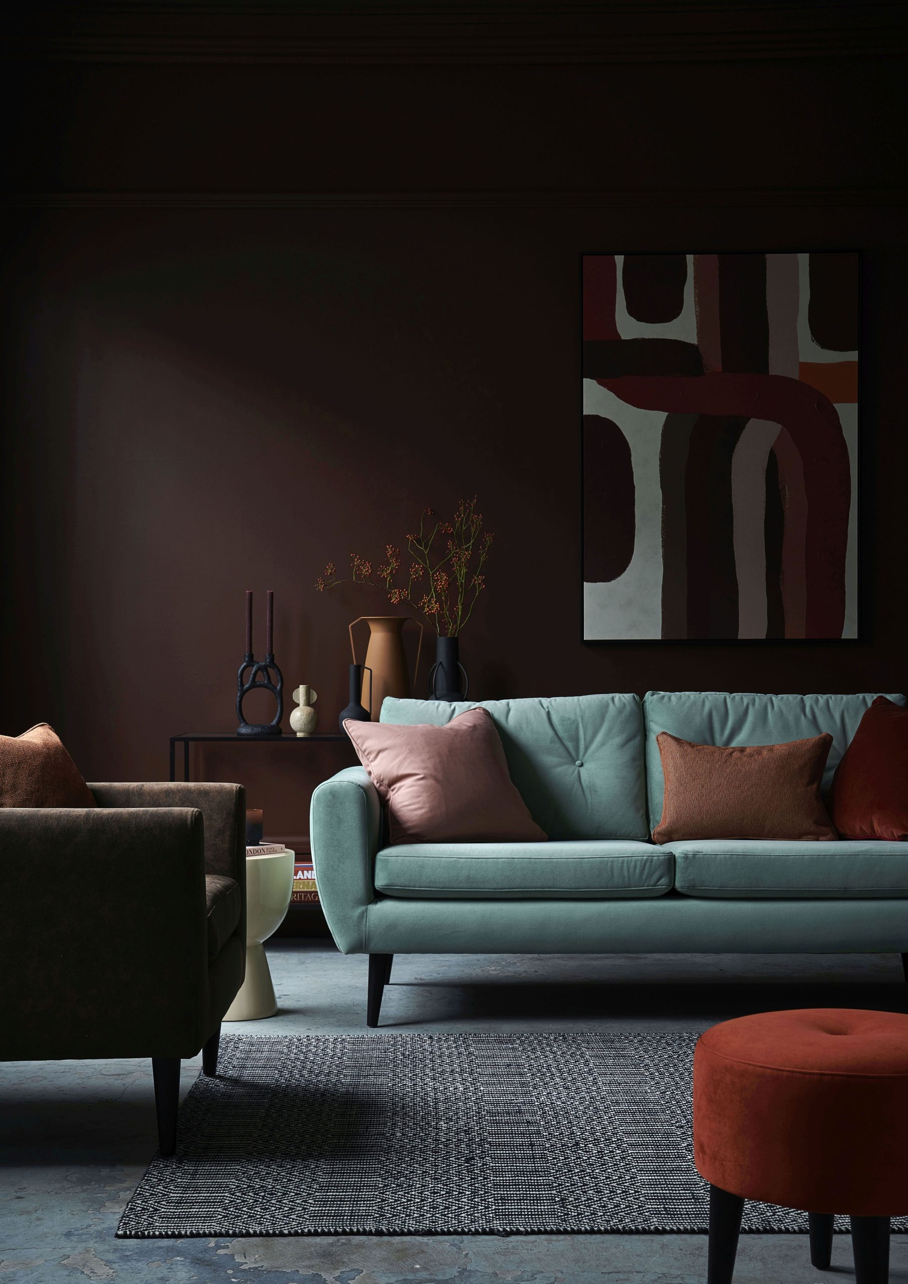
Sofa.com’s exclusive Jack sofa is inspired by British mid-century design and looks wonderful upholstered in Mint velvet against deep burgundy walls.
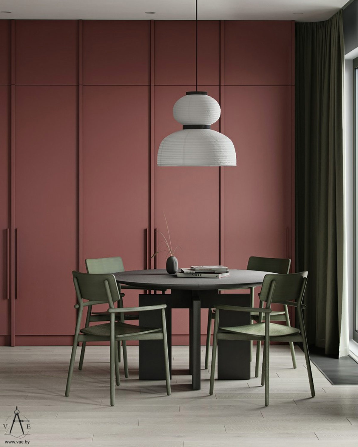
The oversized shade of a Formakami Pendant light hangs over the green and black dining set against terracotta walls.
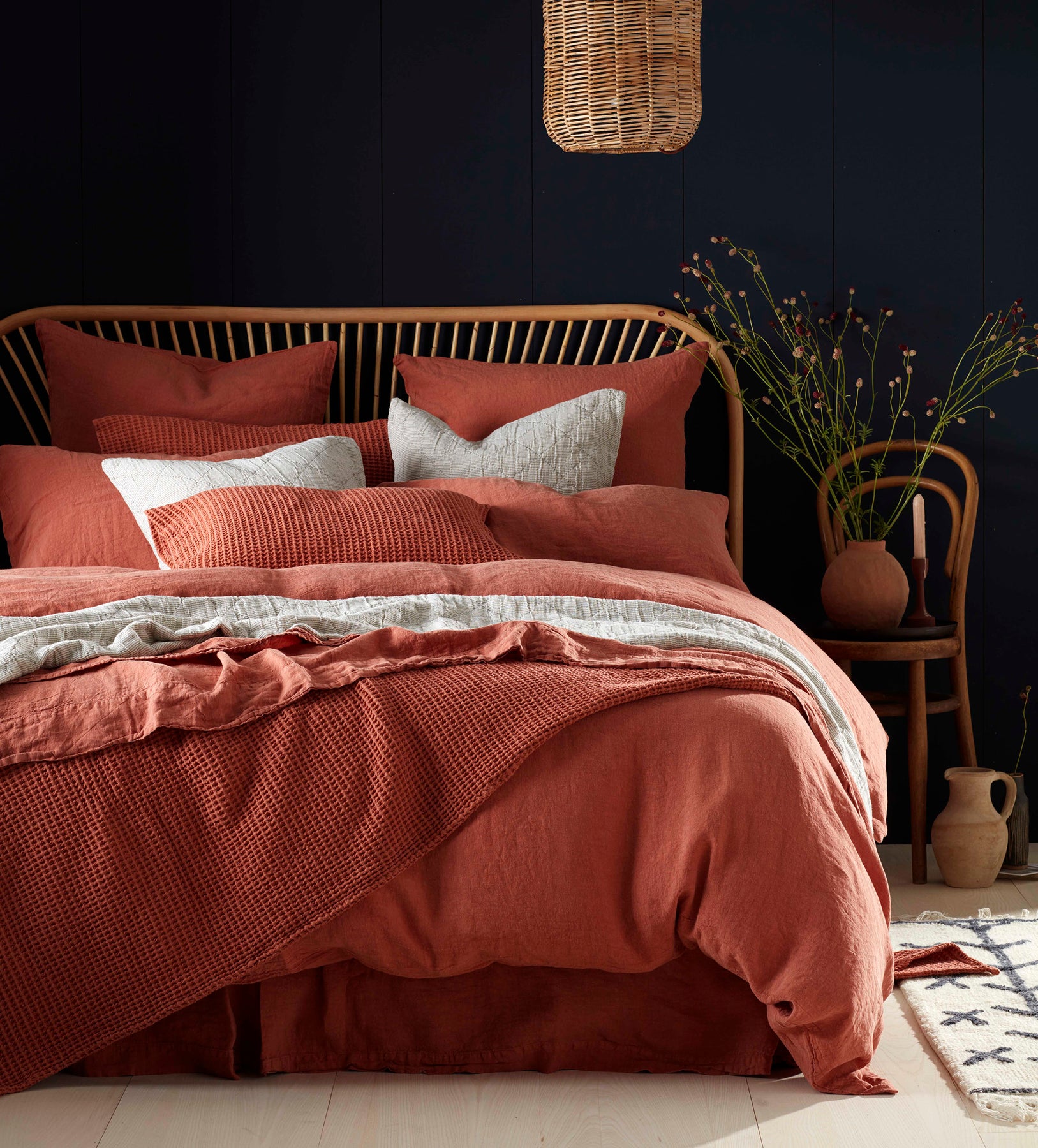
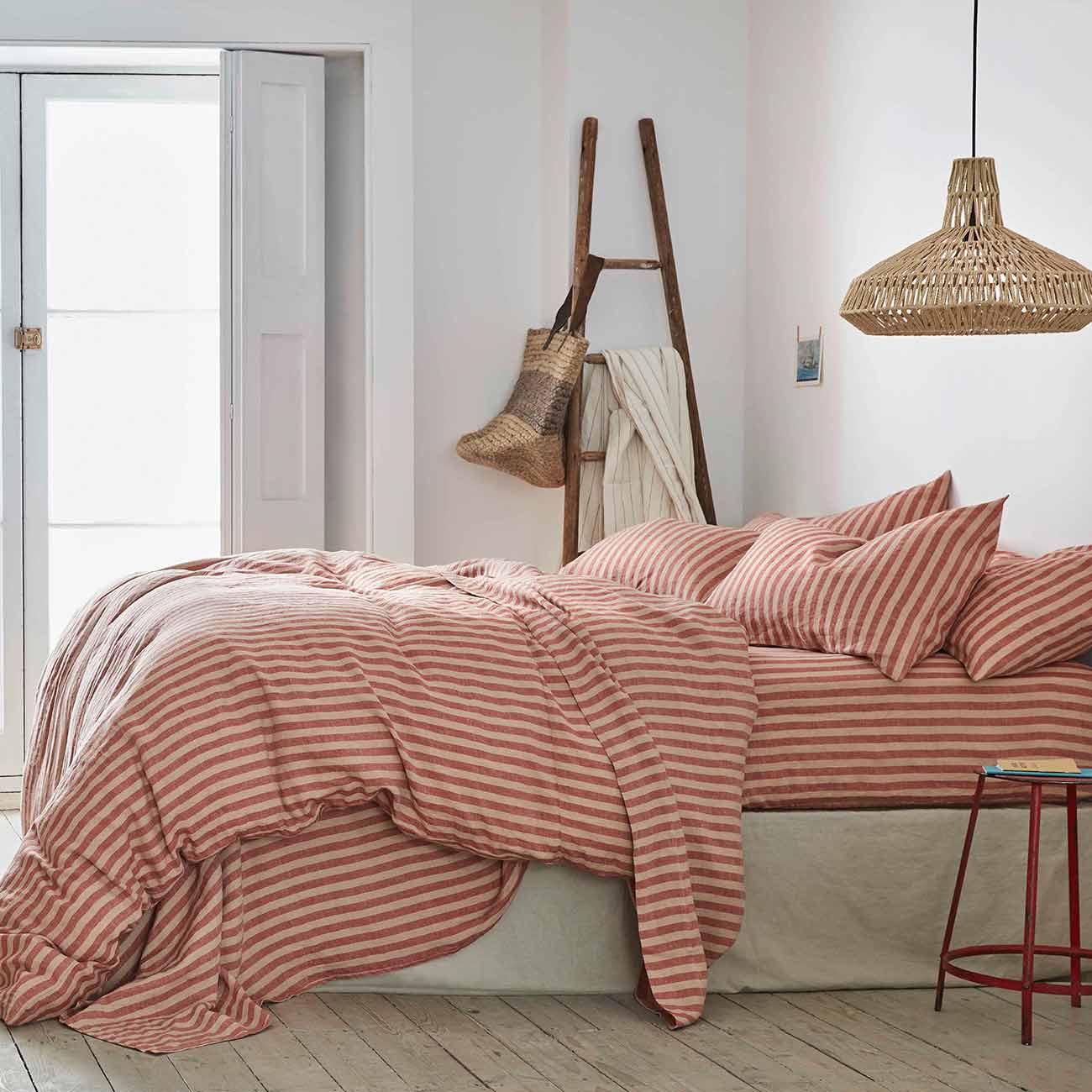
A rusty shade of red works beautifully in this bedroom against deep emerald walls.
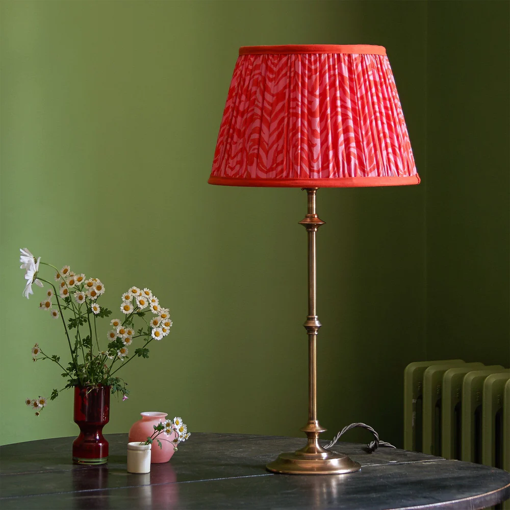
A bright red lampshade in a green room creates visual interest. Lampshades are a great way to introduce a contrasting colour into a scheme.
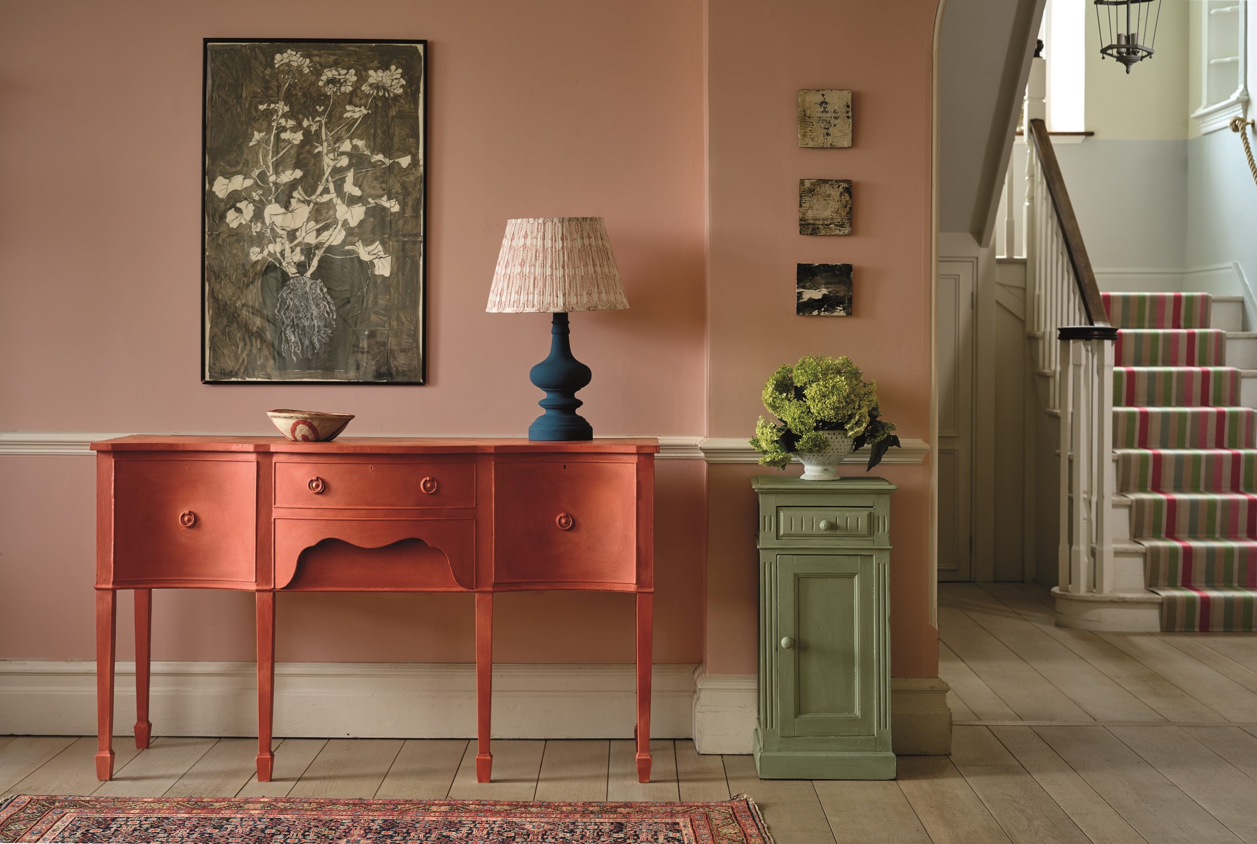
Softer shades of Paprika Red and Capability Green work against a soft pink wall colour. Note the red and green in the stair runner and the vintage rug helping to pull the scheme together.
Here interior designer Alidad has used sage green silk on the walls and brought that unexpected flash of red into the room with the button back armchair.
Soft pink and sage bedding looks striking in this otherwise neutral scheme.
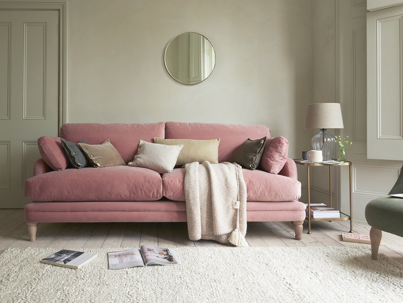
Muted tones of pink and green create a calm, restful feel in this modern sitting room.
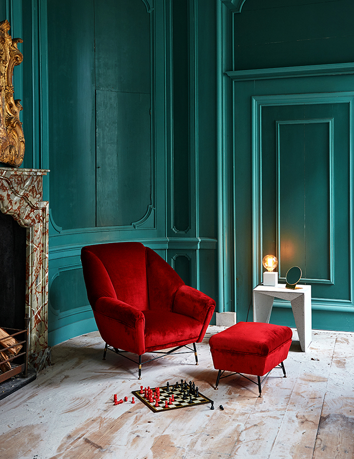
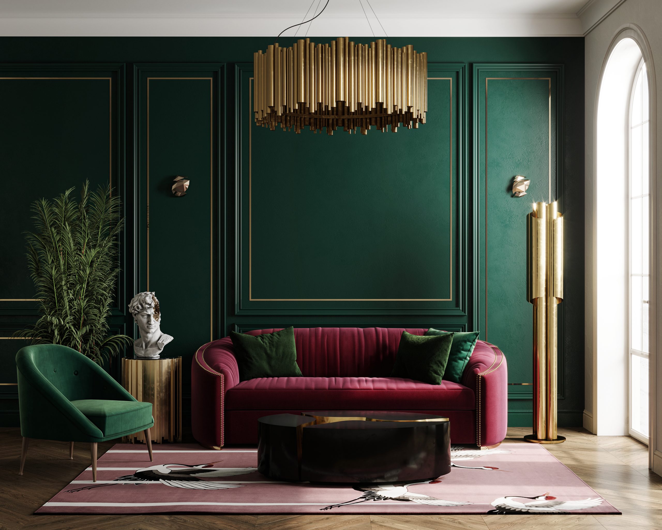
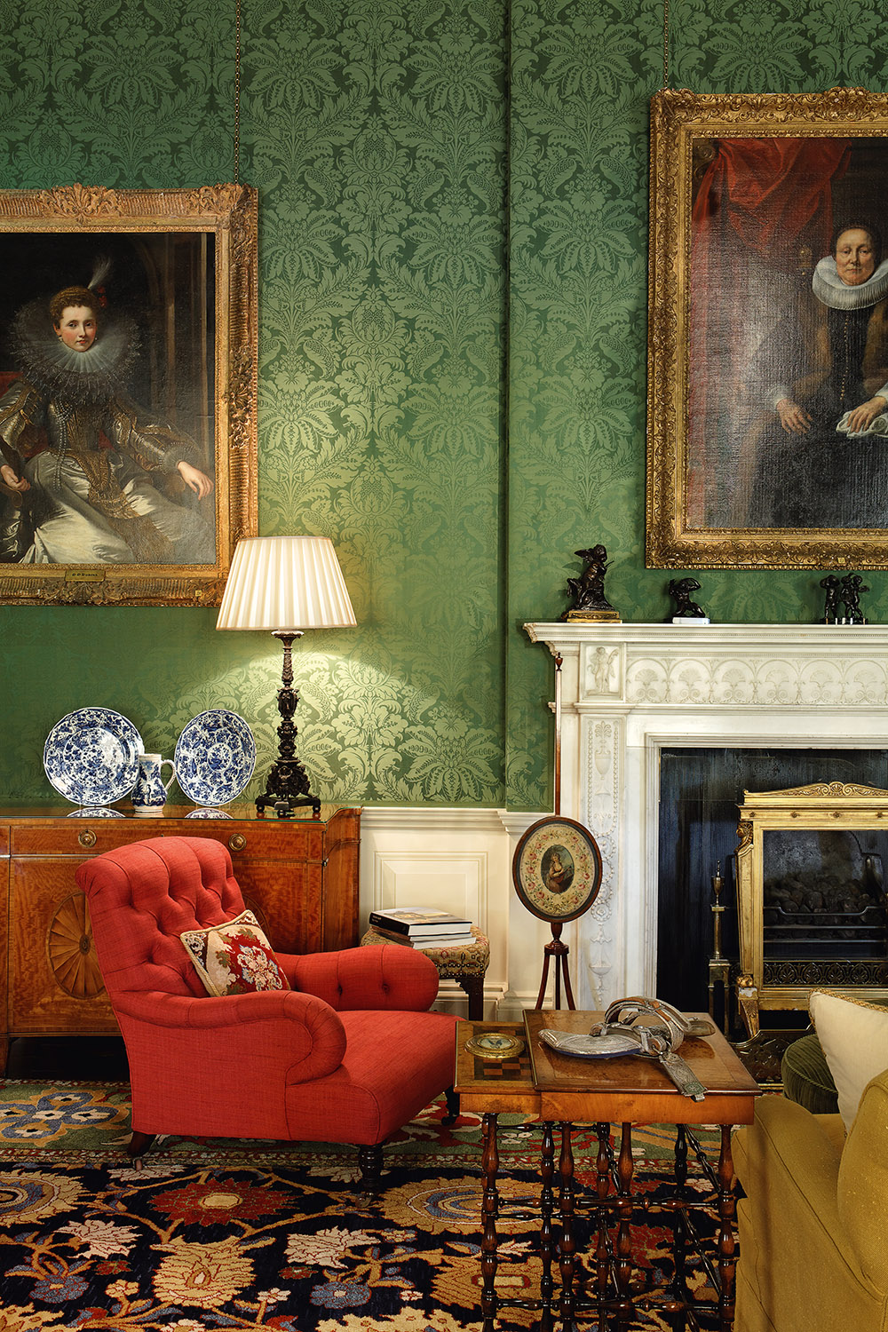
In complete contrast, emerald green walls and deep red velvet furniture create a dramatic look in this traditional meets contemporary room. The white washed floorboards ground the scheme.
Will you try using complementary tones in your next scheme?


