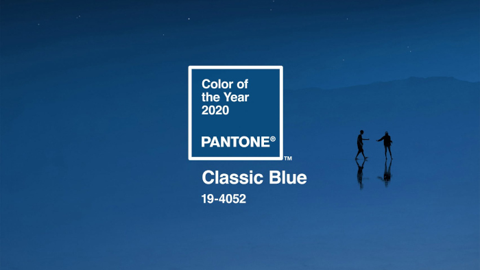
Pantone recently announced their 2020 colour of the year. As we roar into a new decade, one would expect the chosen colour to represent renewal and rebirth… a lush green, perhaps? Indeed, many of those who tried to predict Pantone’s choice opted for a shade of green.
Pantone, however, had other ideas and instead went for 19-4052 Classic Blue. “A timeless and enduring blue hue” that is suggestive of the “sky at dusk”, say Pantone.
It’s a nice colour; a really nice colour. I’d love a velvet sofa in this shade. But it’s quite safe for a company that has previously picked some really striking shades for colour of the year. Who else remembers Radiant Orchard and Greenery?
It seems that Pantone have picked up on the recent shift towards slow-fashion and sustainable design by picking a colour that will never go out of fashion. It’s the kind of hue that always looks contemporary and fresh.
Leatrice Eiseman, executive director of Pantone says, “We are living in a time that requires trust and faith. It is this kind of constancy and confidence that is expressed by Pantone 19-4052 Classic Blue, a solid and dependable blue hue we can always rely on.”
In interior design, this makes Classic Blue a solid colour choice. It goes with a variety of colours, including saffron yellow, pale pink and cherry red.
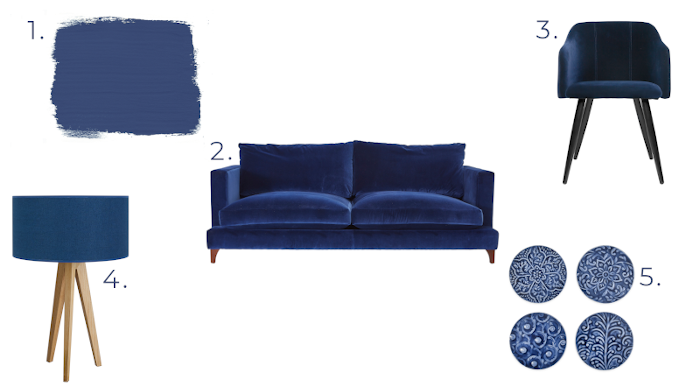
And to finish, here are some of my favourite furniture pieces and accessories currently available in this hue:

1. Annie Sloan Chalk Paint swatch in Napoleonic Blue
2. Darlings of Chelsea Holland Sofa
3. Broste Copenhagen Pernilla Velvet Chair available at Cuckooland


