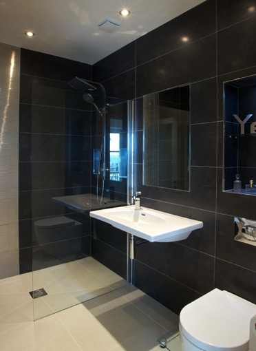
It seems to me that minimalism’s biggest PR problem is the (still widespread) belief that it lacks colour and warmth. Many people picture empty, clinical, all-white interiors as the face of minimalist design and I can see why that would be unappealing; no one wants a cold and unforgiving home. Fortunately, minimalism is rarely like this. It can in fact be the exact opposite. Today I want to talk about moody minimalism; the dramatic, warm spaces that pack a real punch without gathering clutter.
Simplicity is the core principle of minimalist interior design. There should be no fuss, no complication; just beautifully functional spaces to live in. Beyond that, there are no rules. It’s a complete myth that minimalist homes can’t be fun, playful, colourful or moody; just take a look at the drama-filled spaces below…
All of the above spaces are both inviting and visually interesting. They have no need for a gallery wall or hundreds of houseplants or piles or ornaments. Their beauty lies in the simplicity of a carefully considered colour scheme and quality or unique materials. If you want to create a similar look in your own home, here are my tips:
- Choose only 3 or 4 shades in the same colour family and repeat them throughout the space.
- Paint the walls and ceiling the same colour to create uniformity (it also makes the space feel cosier).
- If your home has great architectural details, let them take centre stage. Don’t distract with wall art or lots of unnecessary furniture.
- Two cushions in an interesting print are far better than 10 uninteresting cushions (this principle applies to any accessory).
- Seek out simple but unique furniture, like the marble bedside table in the first photograph.
Always be ready to edit the space in the weeks and months after you’ve decorated. Be prepared to remove anything unnecessary and add things you think the room might need.


