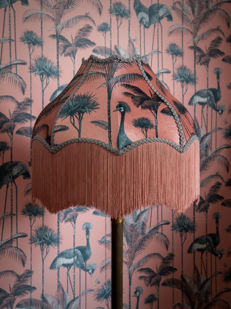
There are hundreds of different patterns, but I group them into a few broad categories to help plan my overall look.
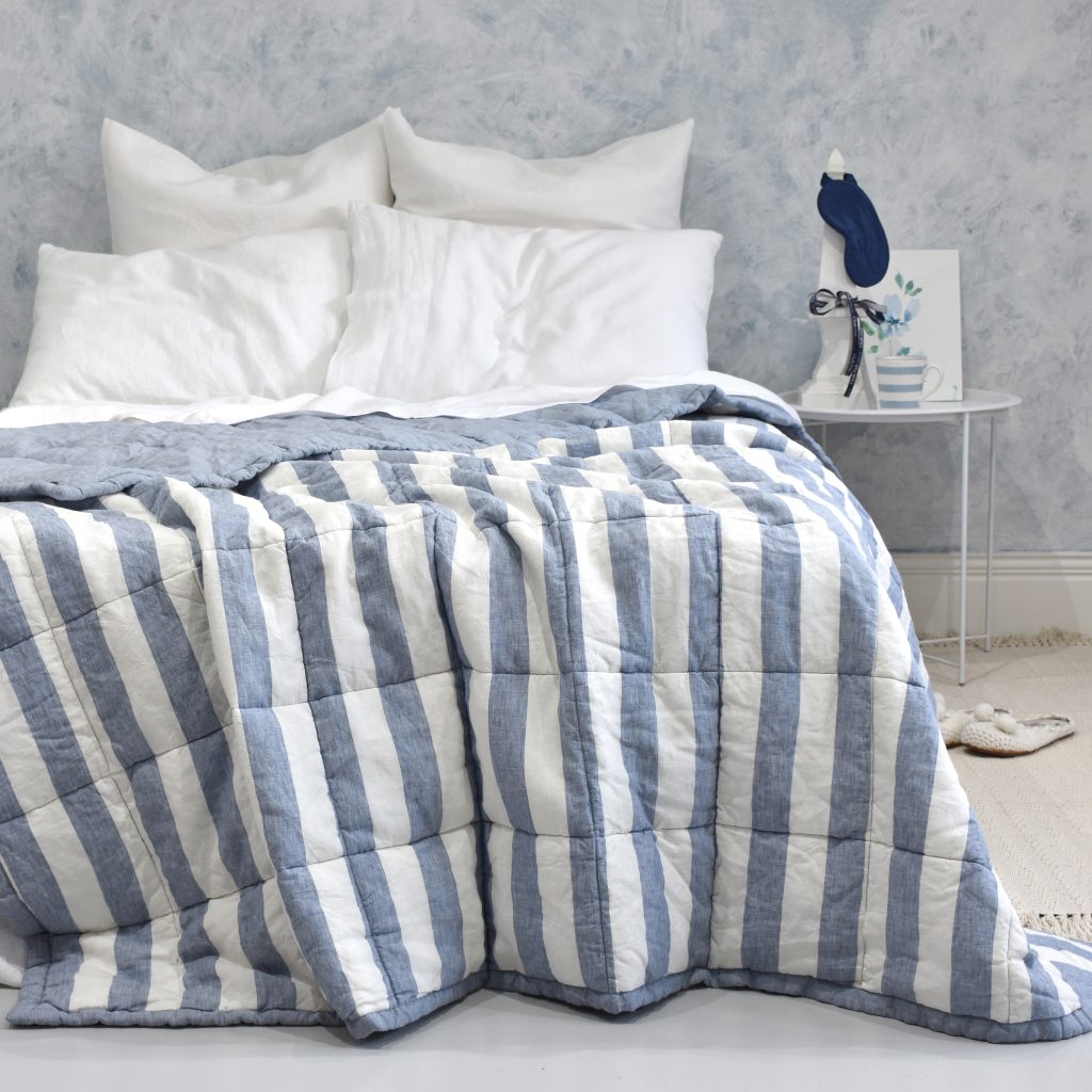
Stripes are the most basic pattern and there are lots of different variations depending on width. Stripes go with pretty much anything so you can mix them with other patterns without fear. Stripes can be sophisticated or rustic and everything in between.
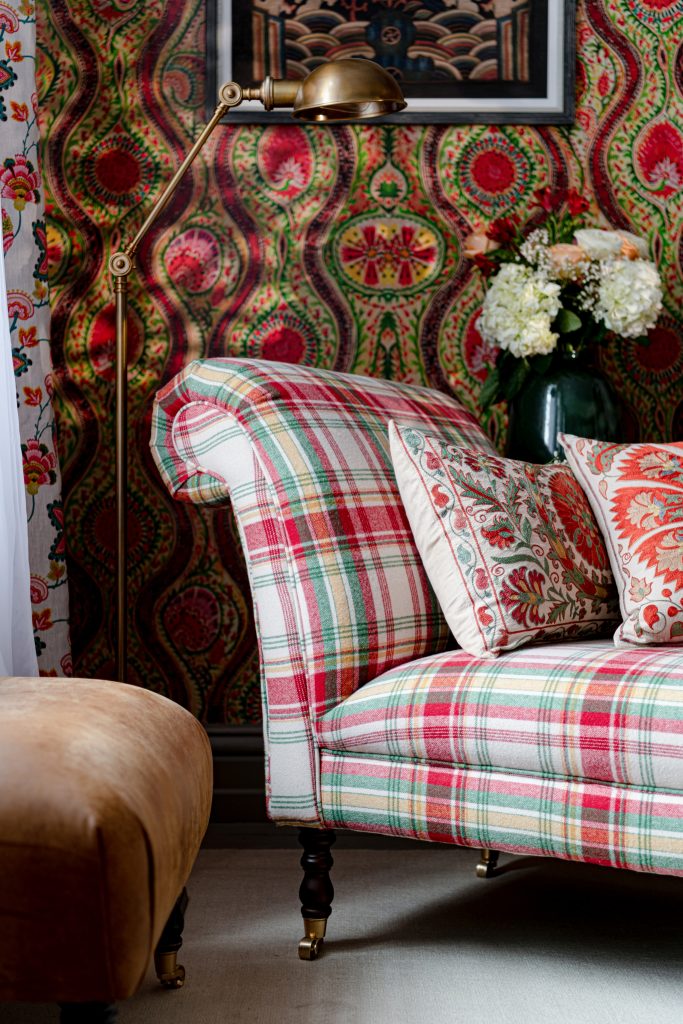
Checked patterns also work well with other patterns and stripes. Checked designs can give more of a country look. Gingham is a classic checkerboard fabric which gives a traditional look. Both work well in country homes.
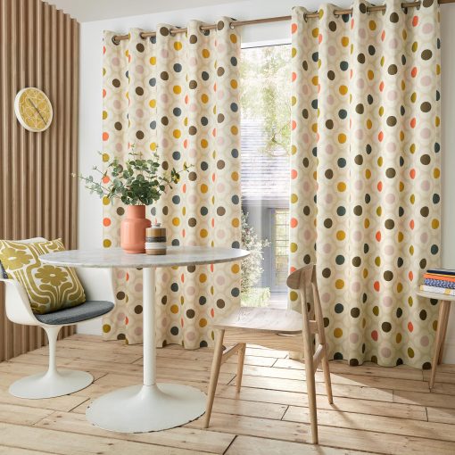
Spots and polka dot patterns are really versatile and work well with other patterns. Spots can be any size and any colour and the background white or a contrasting colour. I love spots in bedrooms, mixed with florals.
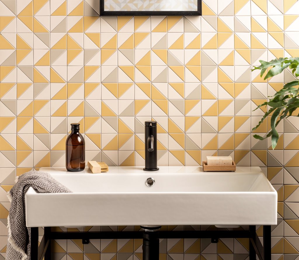
Geometric designs featuring shapes like triangles, ovals, circles or squares can be symmetrical or abstract in design. They are also versatile but tend to work best in contemporary spaces. Think of the iconic designs of the 1950s and 60s.
Tweeds and herringbones with their traditional zig zag patterns often work best in more traditional country houses where their muted tones create a classic look mixing with heritage paint colours and rustic furniture.
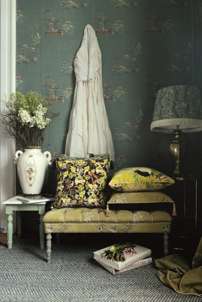
Chinoiserie is based on traditional Chinese designs and features florals, birds, people and scenc. I love using them in bedrooms and bathrooms where I want a pretty feminine look.
Paisley, with its intricate teardrops, originated from Persia and is an opulent design which often adds dramatic colour to a scheme. Cushions in paisley are always a good look.
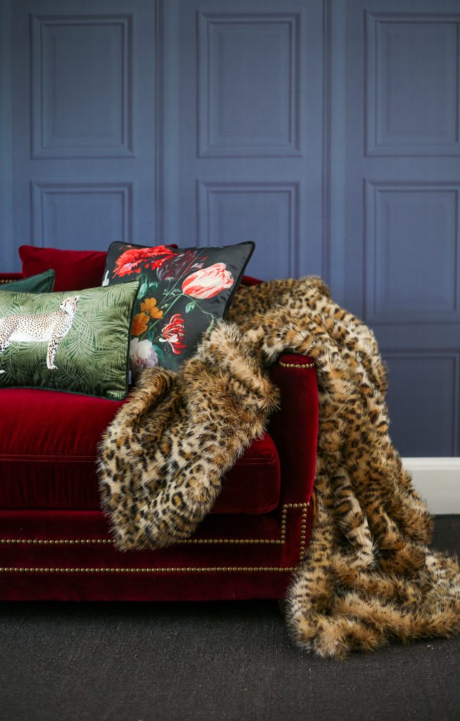
Animal prints like leopard, cheetah, zebra and ocelot can often work well as a neutral to mix with other fabrics. Leopard print, with its rock’n’roll appeal, is great in maximalist interiors where the neutral tones ground your scheme.
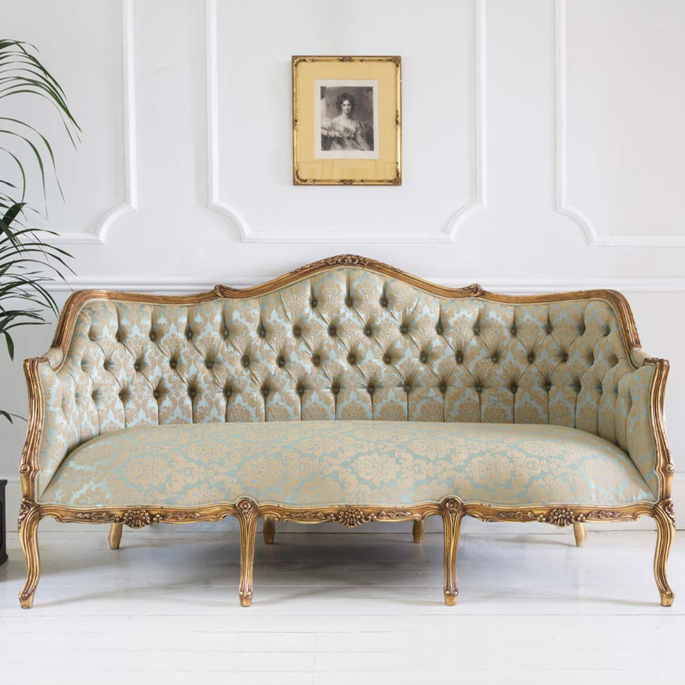
Jacquard, brocade and damask are designs with raised embroidered patterns. It’s a very traditional fabric but looks wonderful in Georgian houses in Bath where the muted colours really work.
Finally, the most popular design – florals! Floral designs are a wonderful way of brightening up our homes. From pretty and romantic to classic or contemporary, floral designs are a timeless favourite that never goes out of fashion. It’s hard to talk about florals as a single category because, like flowers, each pattern has its own personality, style, size, and colour. There are four main groups – small florals. large florals, vintage florals and bold modern florals. Which floral pattern you choose will determine the overall feel of your room. I love them all!
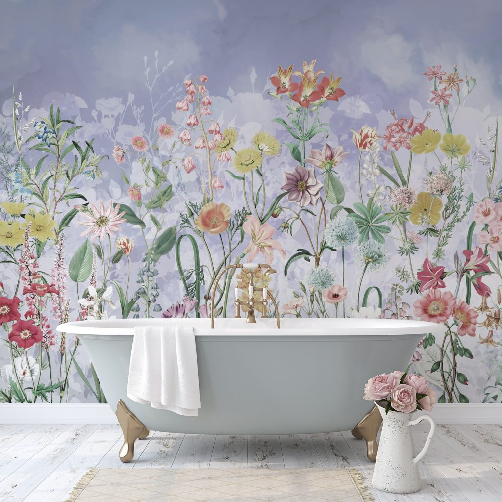
Small florals – Ikea might have told us to ‘Chuck Out Your Chintz’ back in the 90s but chintz fabrics are having a moment. Fans of Grandmillennial style are using traditional Victorian designs and mixing them with 60s furniture and 70s prints for an eclectic thrown together style that looks effortlessly cool. These pretty designs work well in country-style schemes and small rooms where large prints may overwhelm.
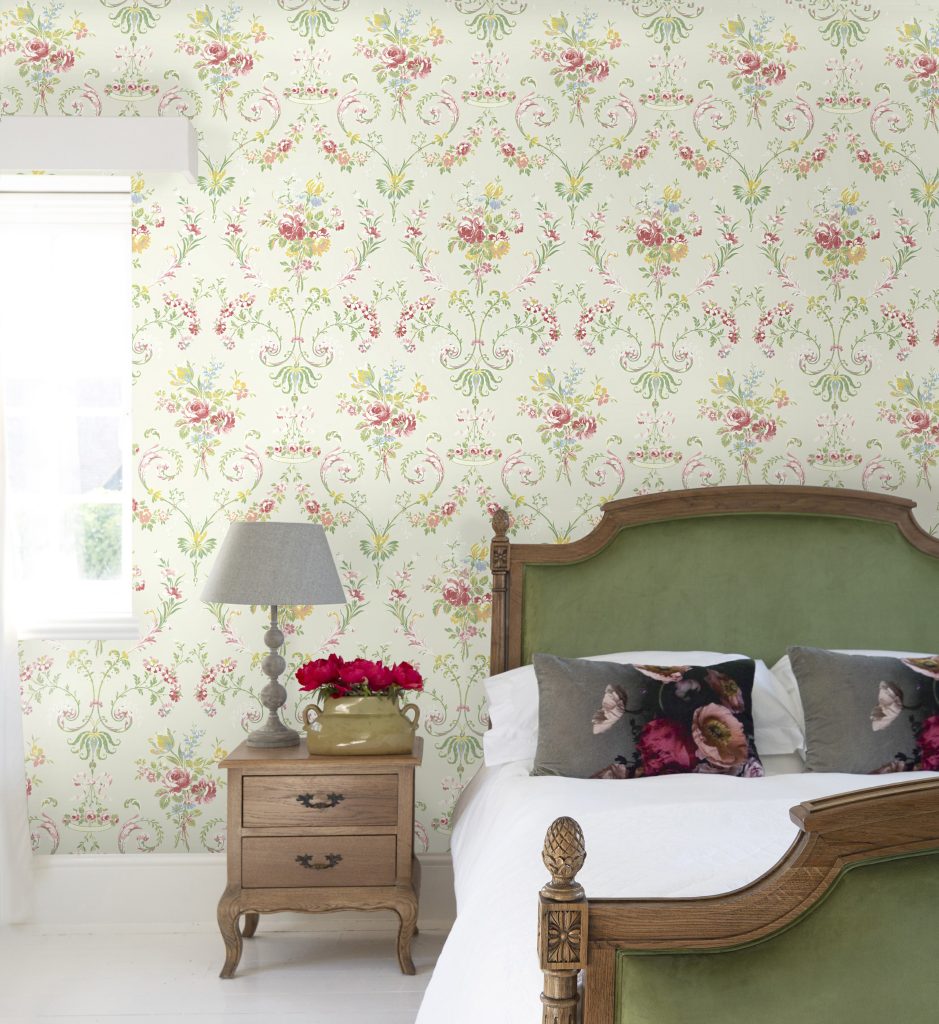
Large florals – If subtle prints are a little too safe, make a statement with bold, oversized blooms. Large floral designs in vivid colours work well in a contemporary setting. Choose a bold floral curtain fabric as your starting point, then pick out an accent colour for accessories such as cushions, rugs and textiles. Go bold with vivid florals or be brave with botanicals which are a fresh take on a floral fabric. Keep the rest of your room natural with wood flooring and white walls to really make the patterns sing.
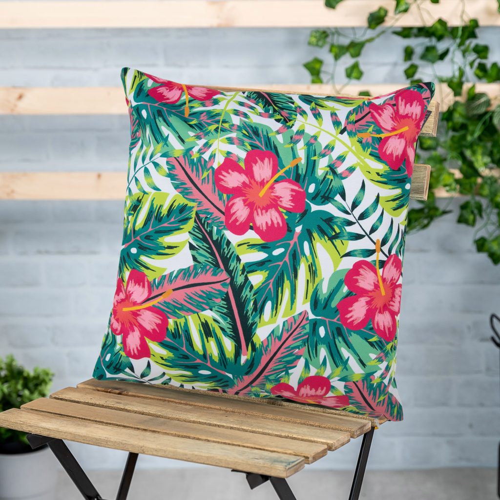
Vintage florals – Vintage florals often have a prominent, neutral base colour which let the florals stand out. Design-wise look for 1950s prints featuring romantic bouquets and blossoming roses, Op-Art graphic designs from the 1960s or 1970s inspired psychedelic florals.
Bold modern florals – Bold, energetic, and often oversized, these graphic florals feel fresh and adventurous and complement modern interior schemes. The imagery can be abstract, painterly or hand drawn. Modern florals are ideal in spaces with clean lines and neutral furnishings. The trick is to keep the rest of the room pattern-free and use texture instead. This will allow the floral fabric to be a feature of the room.
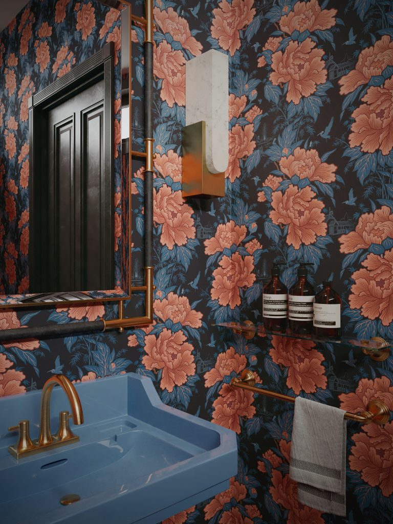
Within these broad pattern categories there are many variations, but if you understand the basic groups of pattern it will help you plan your scheme. Getting the balance right when mixing patterns and prints is vital to a room’s success. Using pattern takes careful planning and a good eye to create an overall effect that expresses personality and creative flair.


