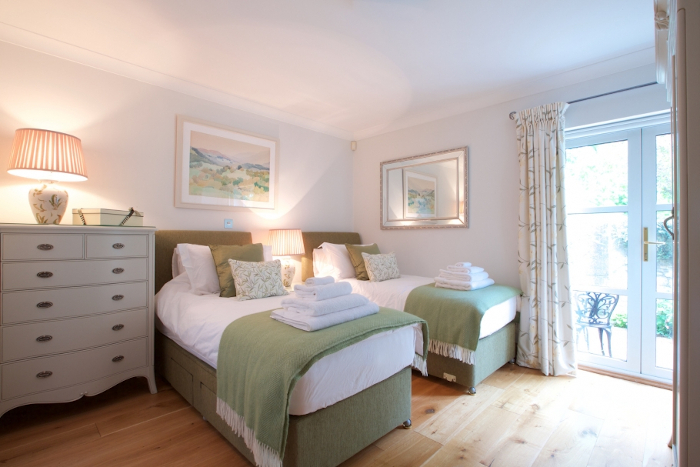
Image copyright Clair Strong Interior Design
Last week I started writing about new traditionalism. This trend sees classic design revived with more than a few modern updates. You may already be familiar with it, but for a more detailed introduction, check out part one of this series here.
In today’s post, we’re focusing on the practicalities of this trend. More specifically; how to adopt it without inadvertently creating a stuffy and outdated space? Read on for my tips.
Always Edit
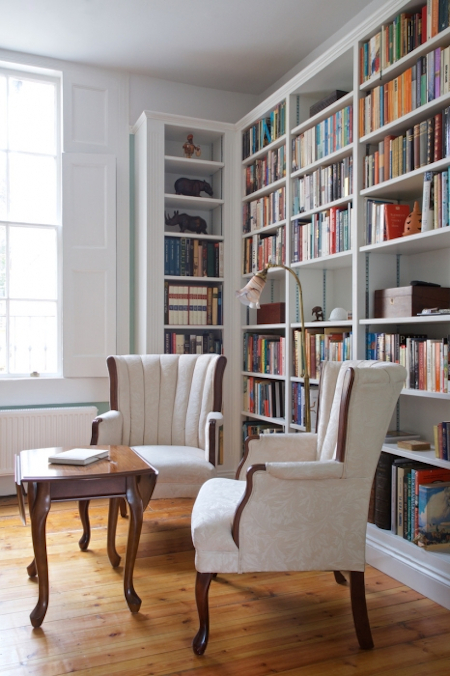
When you’re combining vintage furniture, elaborate patterns, ornate details and lots of texture (fringing, ruffles, embroidery etc) you need to know where to edit. There’s a very fine line between layered and cluttered, especially in a trend as detail-focused as this. My biggest piece of advice is to edit frequently and ruthlessly.
People often think that to edit, they must remove or take away. But editing can also include rearranging and adding objects into the space. Editing simply helps you create balance and reduce visual clutter. An editors job is never fully done, so always be on the lookout for areas that just don’t sit right.
Choose Fresh and Modern Colours

Image copyright Clair Strong Interior Design
Modern and fresh colours take traditionalism from frumpy to stylish. White is a classic and it creates negative space which allows other details to take centre stage. You could also use hues that are trendy right now, such as lilac, mint green, dusty pink and yellow to create a striking juxtaposition between the old and new.
Decorate with Items you Love
Don’t fall into the trend trap and buy furniture or accessories just because they’re fashionable. The driving force behind new traditionalism is actually a shunning of trends. It’s about comfort and aesthetics and decorating with objects because you love them.
After all, isn’t the whole point of interior design to create a home you love to be in?


